Agapanthus Flower Studio
Brand identity design for an Edinburgh based florist.
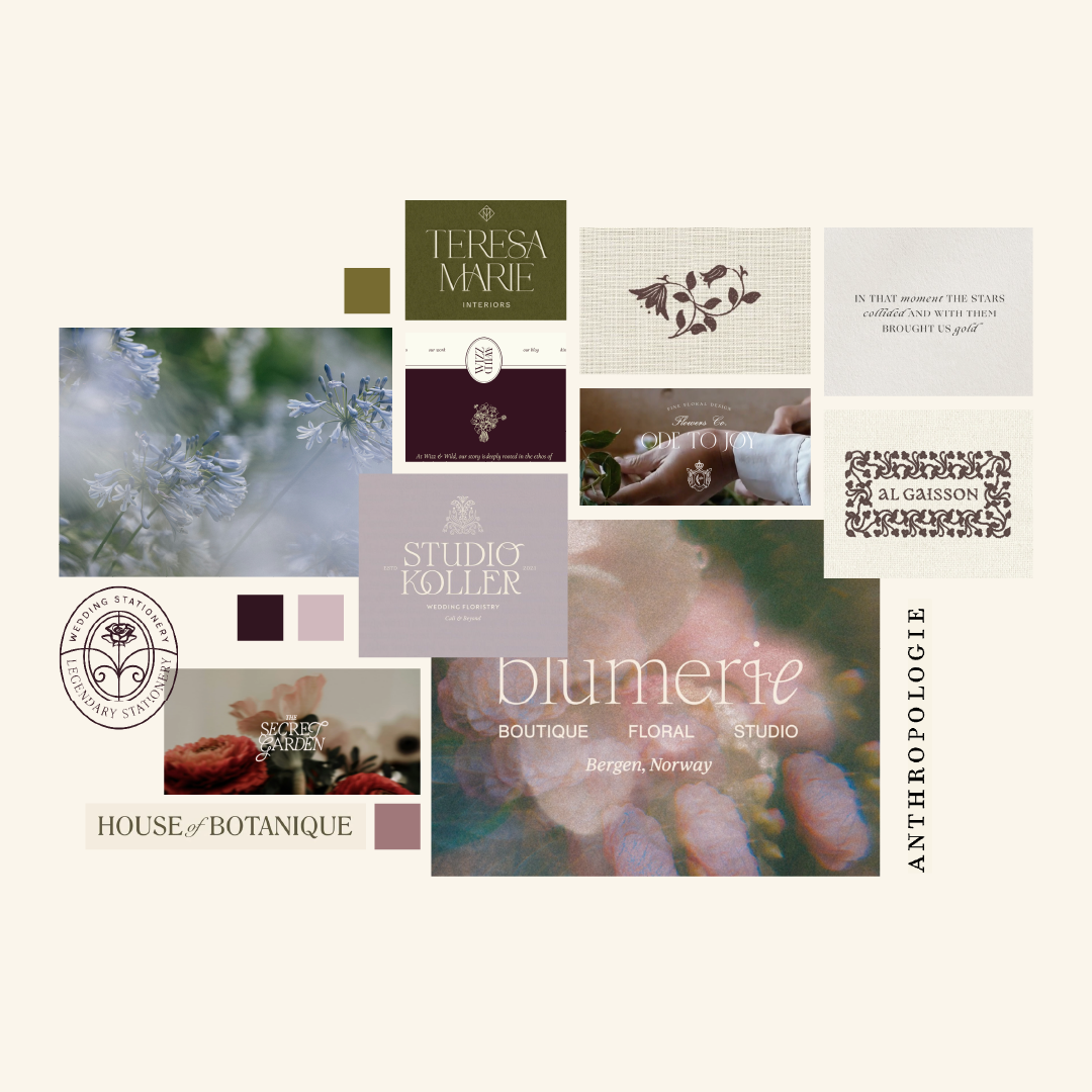
(01) Creative Direction Concept
Soft, romantic, and nostalgic; like stepping into an old-world captured on faded film.This aesthetic blends antique charm with dreamy energy.
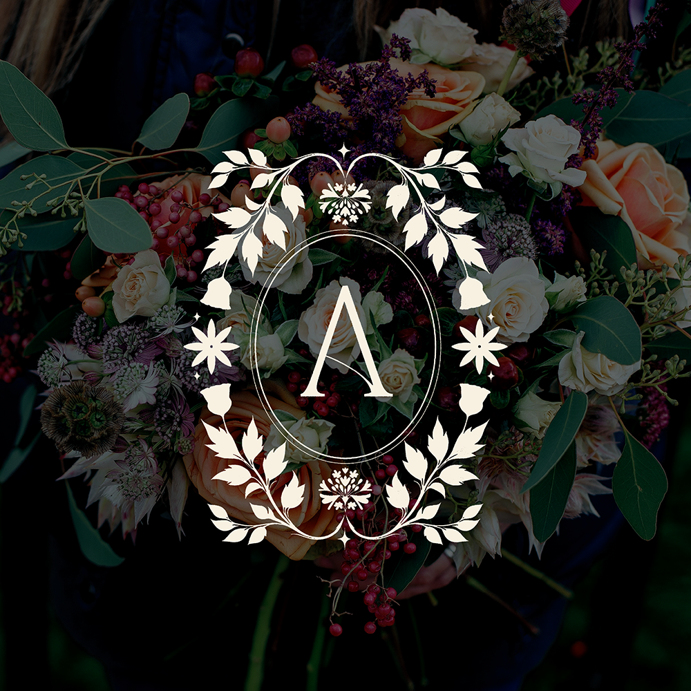
(02) Logo Suite
The logo features a word-mark version, a bespoke flower icon and an antique style “A”. All of these were carefully crafted for Agapanthus, to reflect the personable yet refined approach the studio practices in regards to creating floral arrangements.
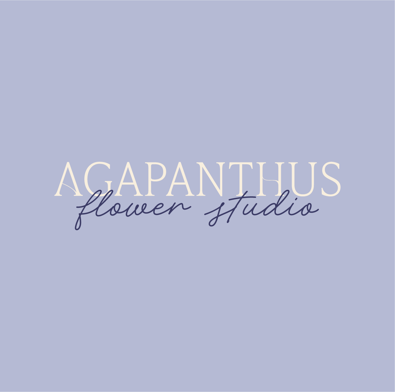
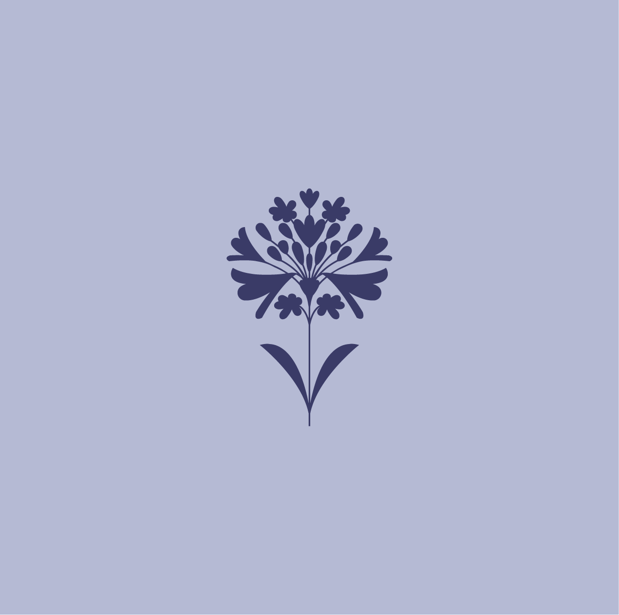
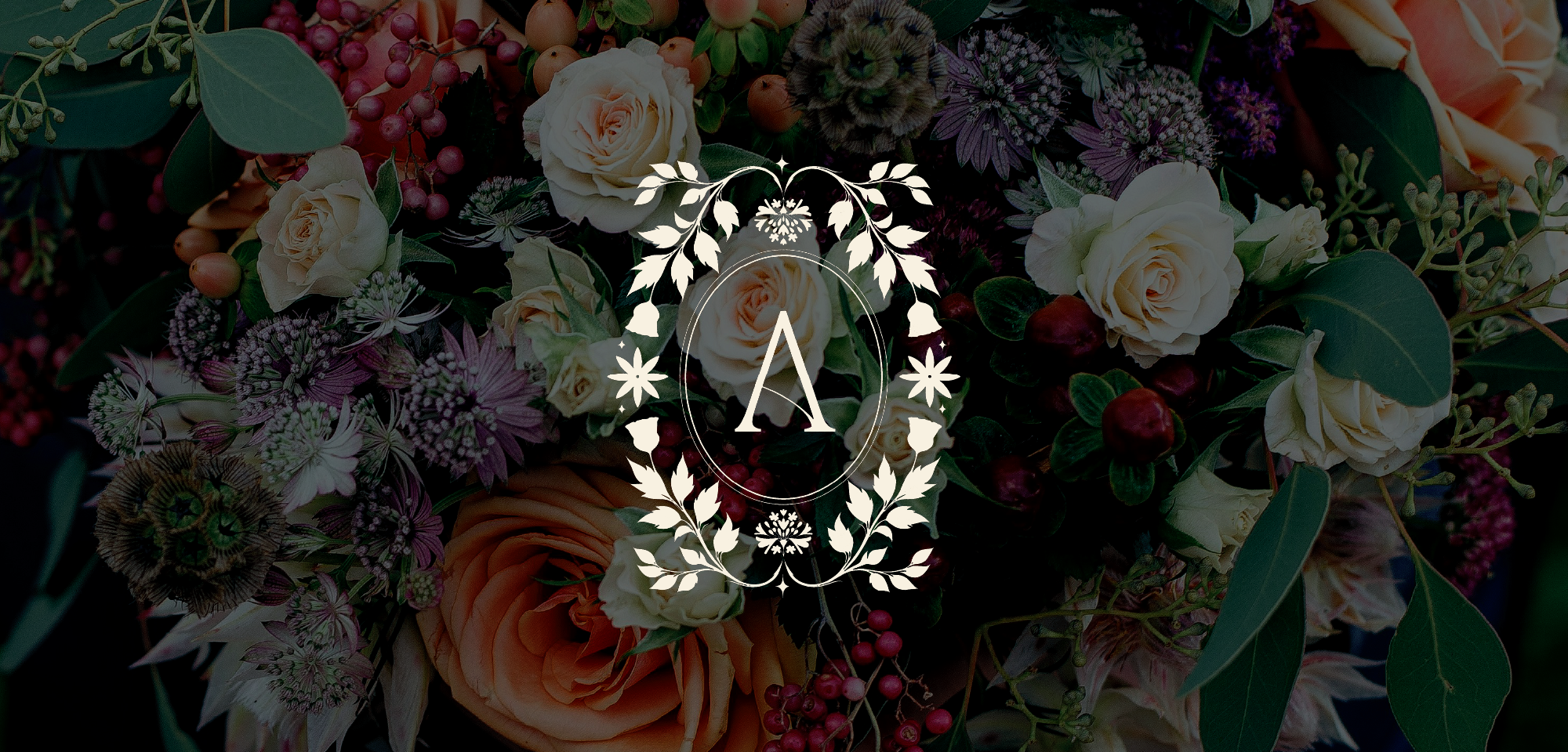
(02) Logo Suite
The logo features a word-mark version, a bespoke flower icon and an antique style “A”. All of these were carefully crafted for Agapanthus, to reflect the personable yet refined approach the studio practices in regards to creating floral arrangements.
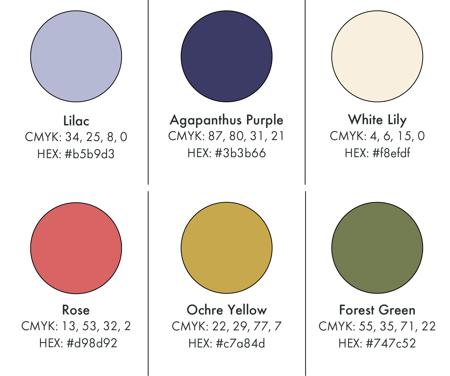
A palette based around the purple of the Agapanthus flower.
(03) Colour Palette
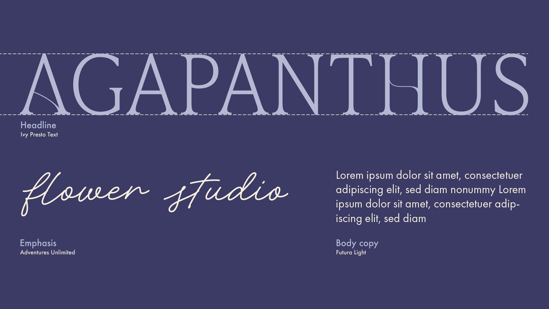
The classic serif headline font of “Ivy Presto” pairs well with the more modern and clean Futura - ensuring a luxury yet contemporary feel overall. The “Adventures Unlimited” handwritten font adds a touch of personality and friendliness to the brand.
(04) Typography
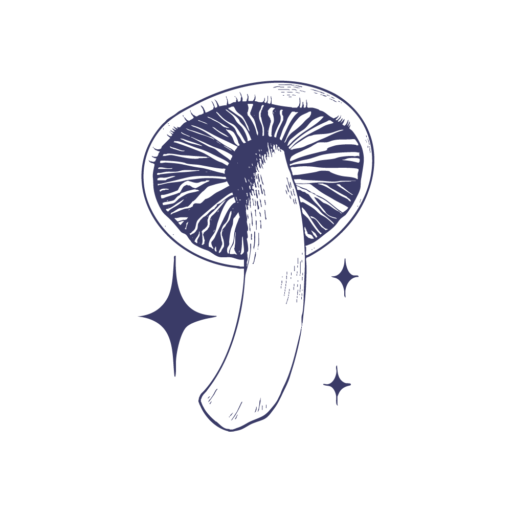
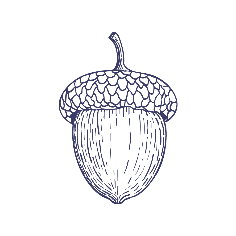
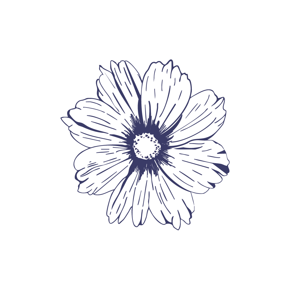
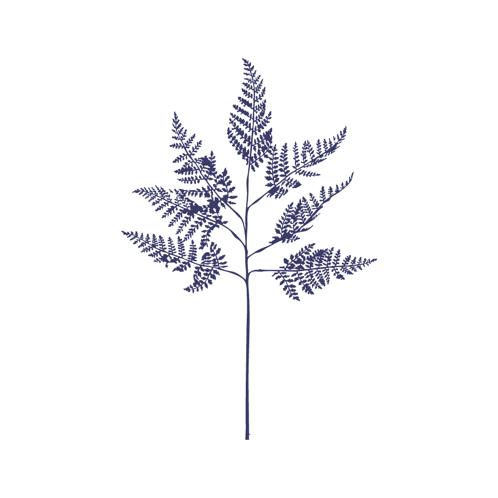
(05) Illustrations
Hand-drawn illustrations of floral and fauna regularly used in Agapanthus Studio’s arrangements.
These will be used to add personality on socials and the website.
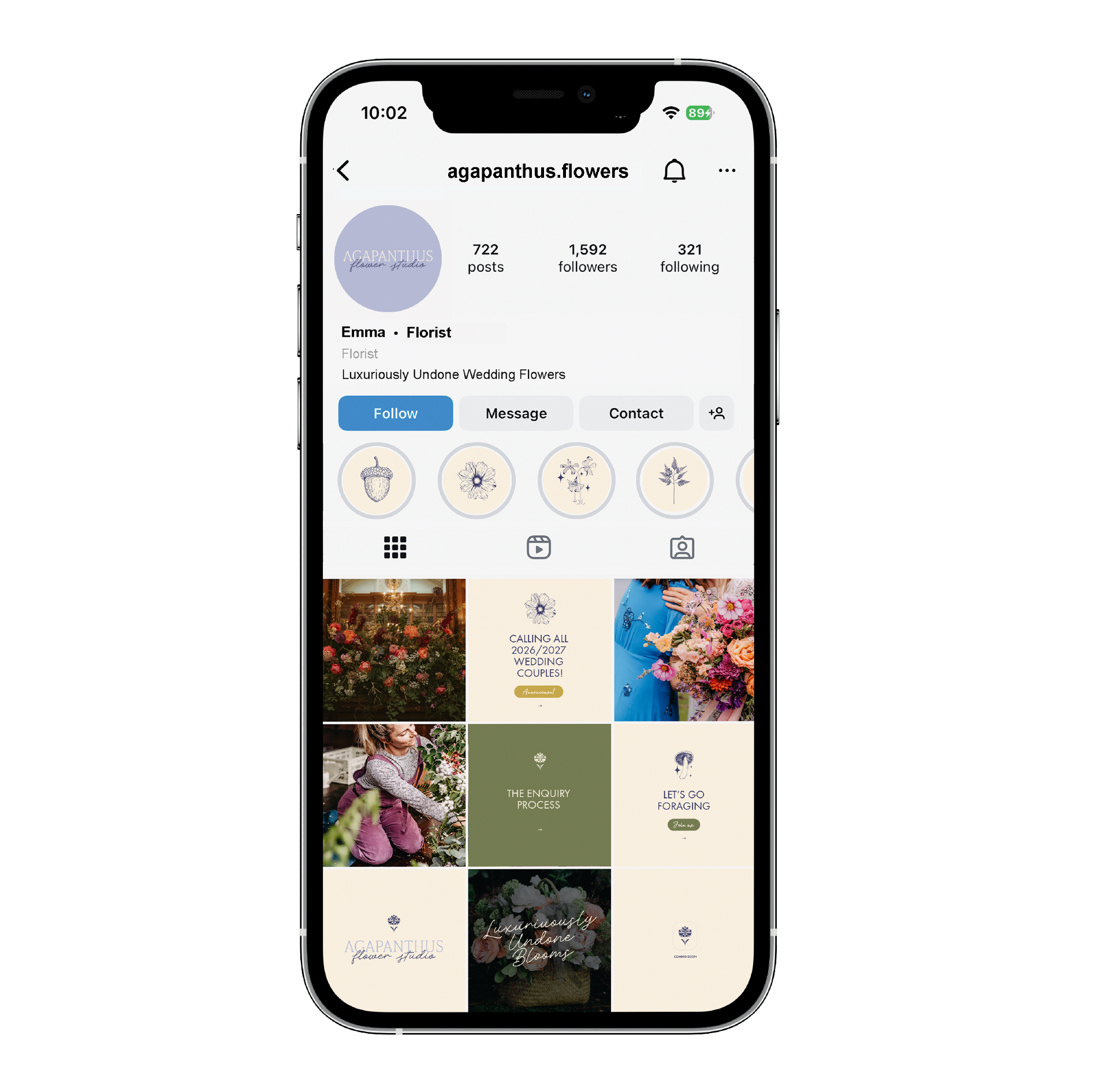
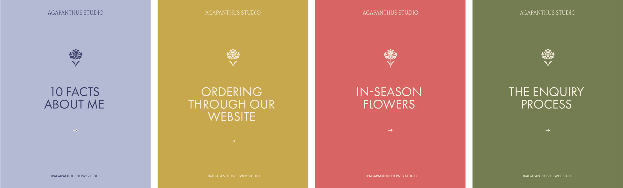
Clean and refined Canva templates created to let the floral arrangements shine.
(06) Social Media