rocket science
Brand identity design for a research and social impact consultancy.
(01) Logo Suite
The logo rationale below shows how the logo mark was conceptualised.
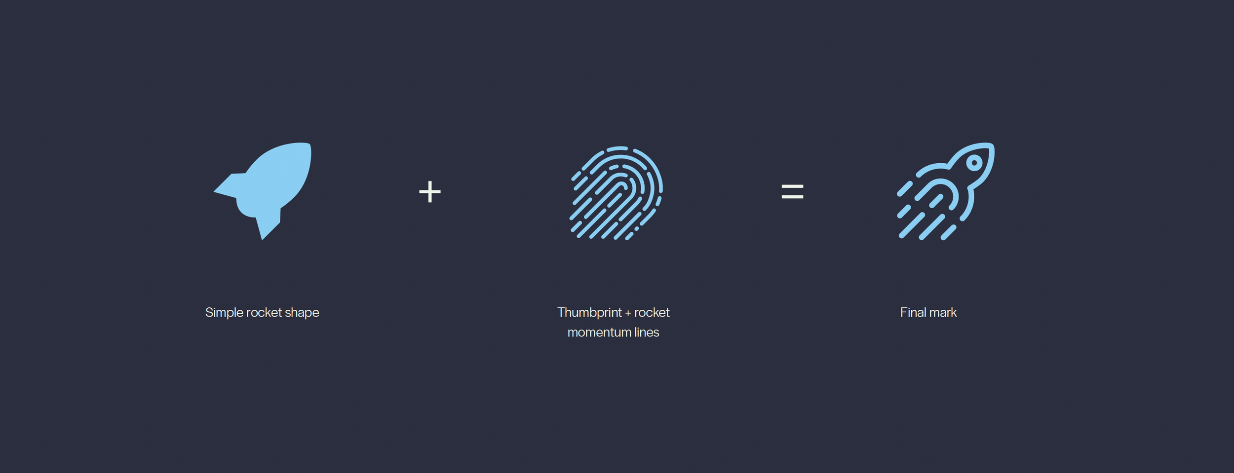
The upward trajectory of the rocket conveys momentum and confidence, reinforcing the focus on strategic decision making, not just research or analysis.The rocket in combination with the thumbprint signals collaboration with clients using a human centred approach.



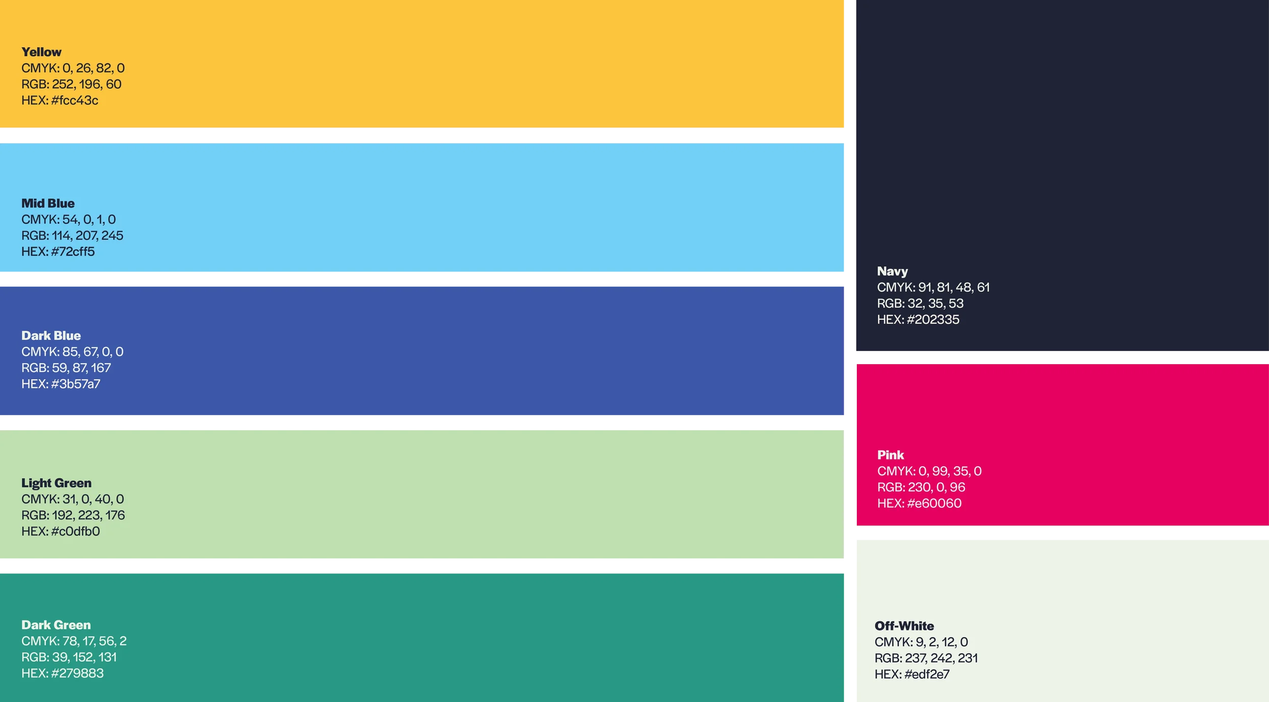
The palette was based around the zingy pink colour which conveys a sense of energy, alternative thinking and authority.
(02) Colour Palette
(03) Typography
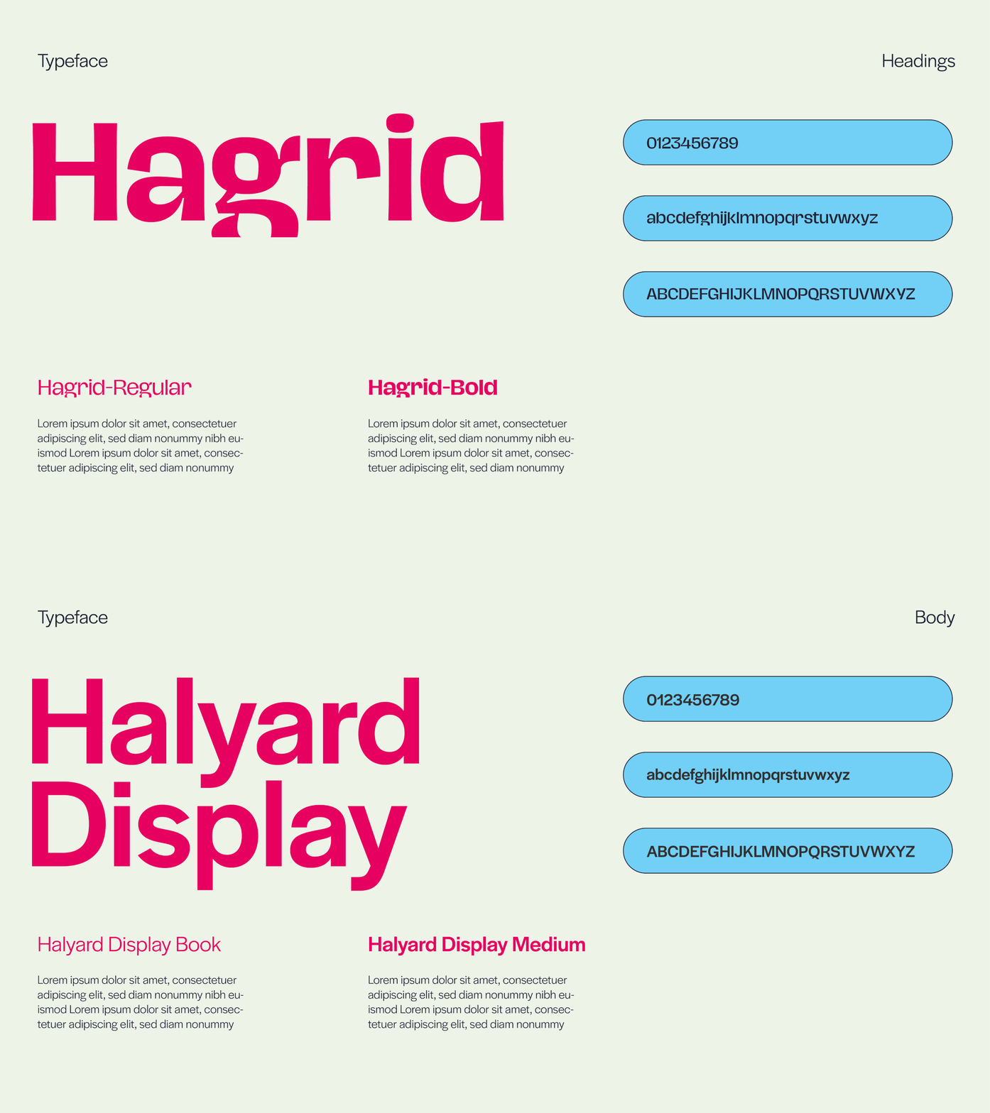
Hagrid is a bold but clear typeface that reinforces the values of transparency and authority, while Halyard Display is a is a complementary font to Hagrid, but less bold and so ideal for body copy.
(04) Iconography

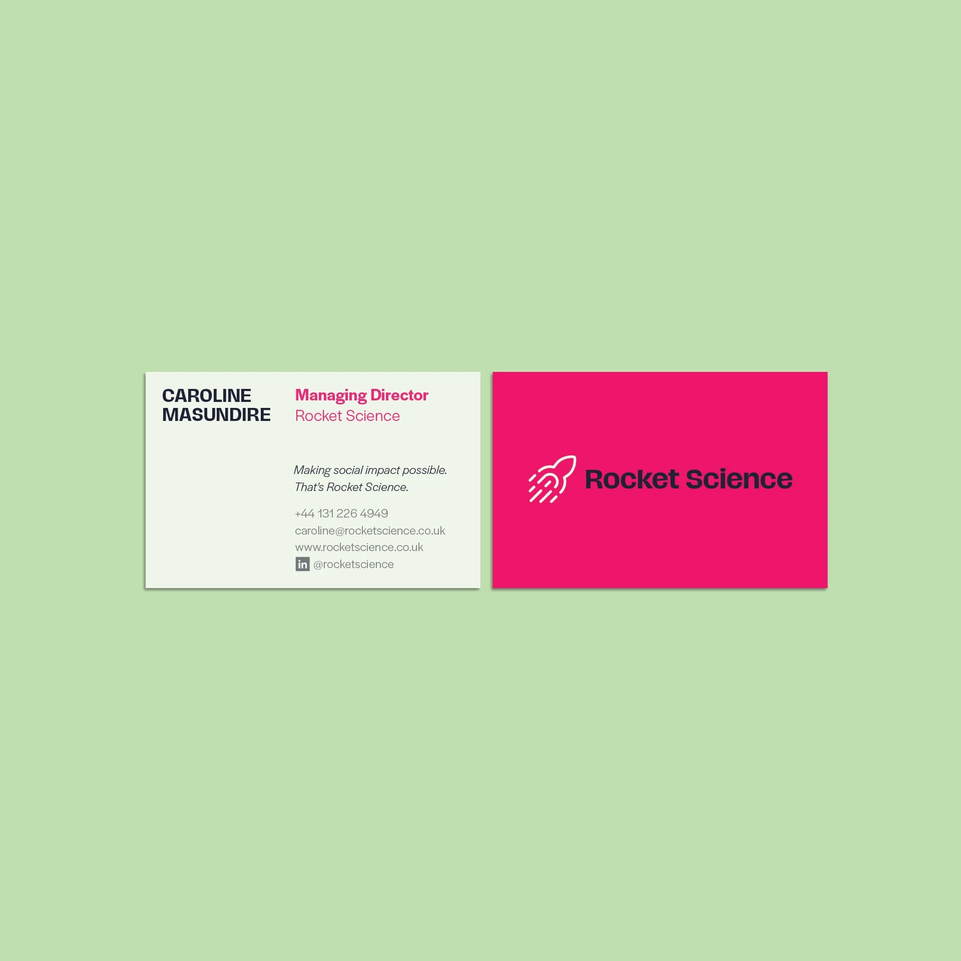
(06) Stationery