scotia works
Brand identity and website design for a signage manufacturing company.

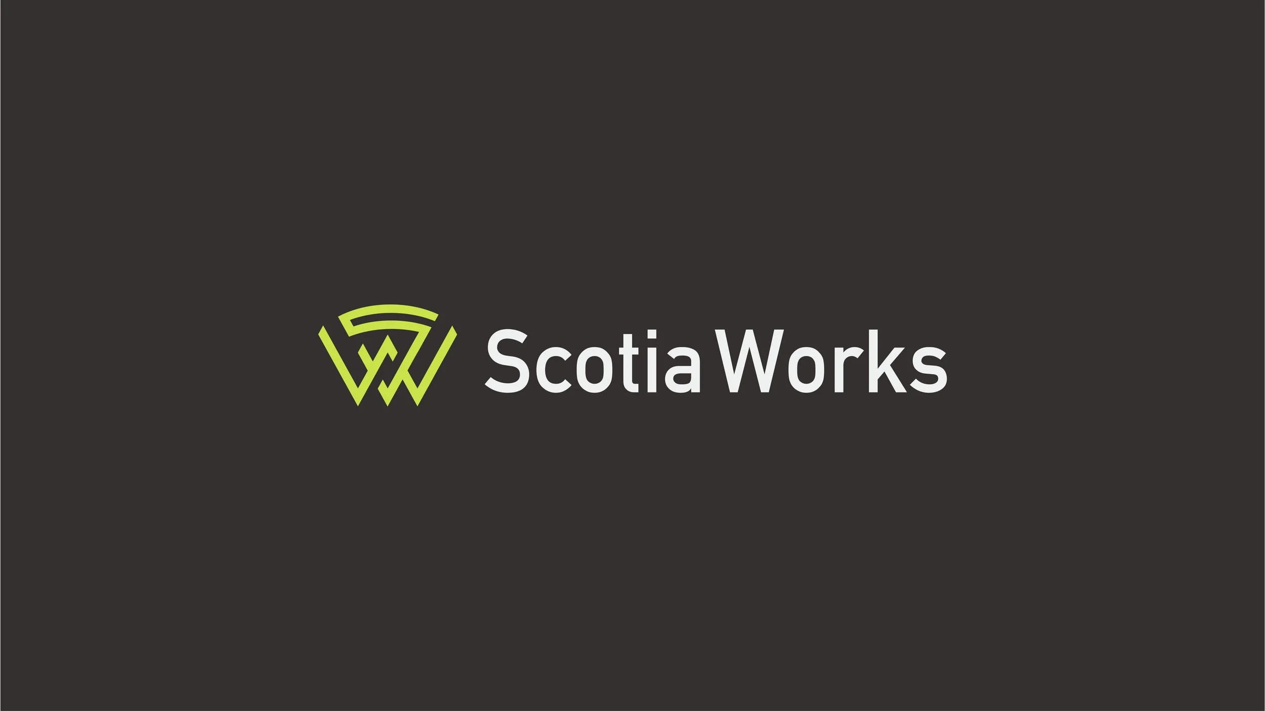
(01) Logo Suite
The logo was created by making a monogram mark out of the "S + W" in “Scotia Works.

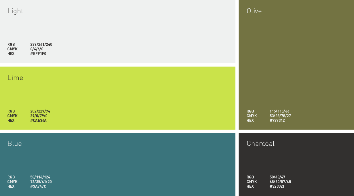
The palette is a modern love letter to Scotland (where Scotia Works are based). Featuring the classic blue from the Scottish flag, acompanied by zingy and earthy greens which act to modernise the brand as a whole.
(02) Colour Palette
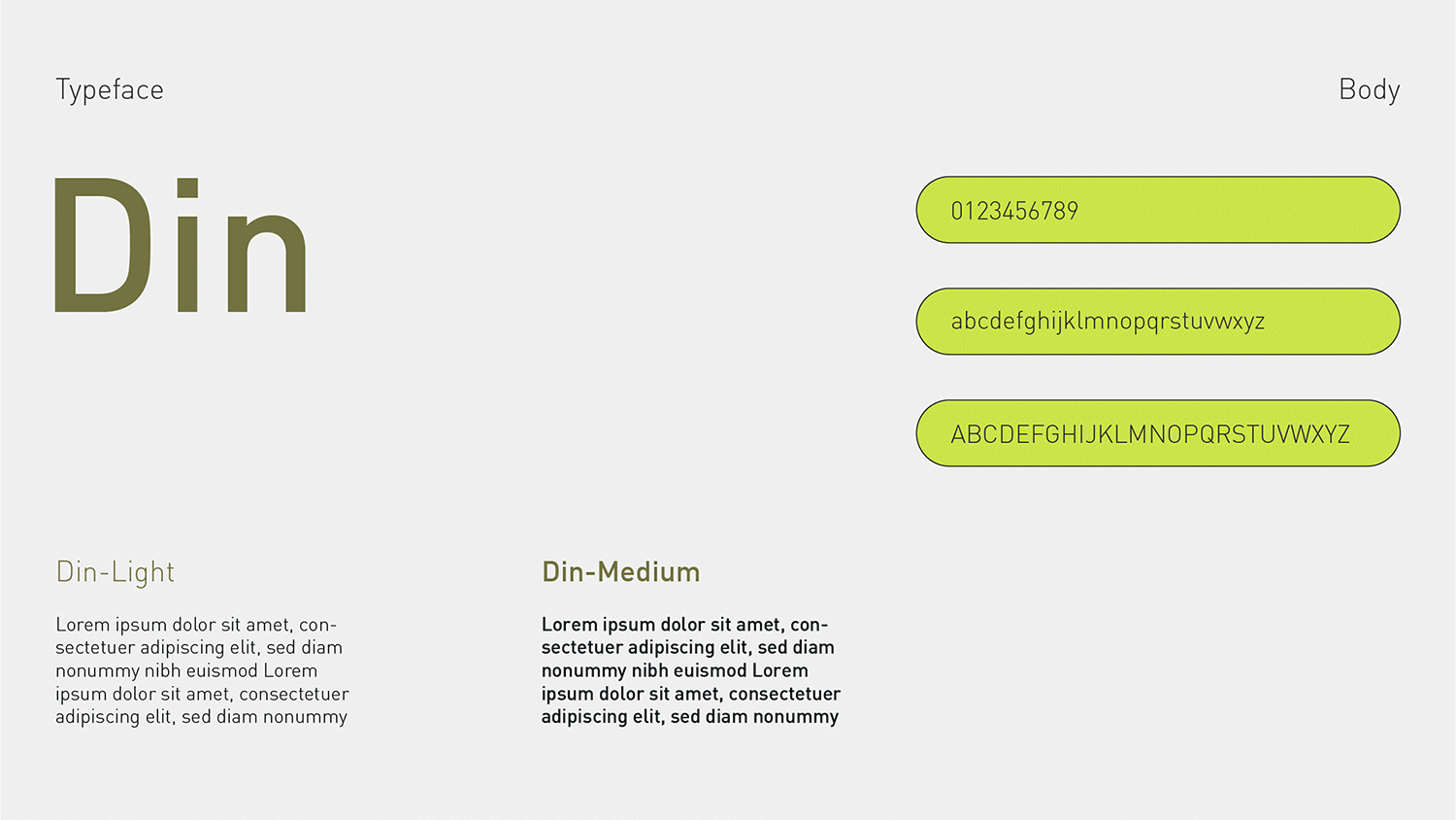
(03) Typography
Din is a classic typeface which gave the new brand a sense of integrity. Paired with the characterful “Manofa” which nicely represents the sense of innovation the brand were looking to achieve with the new identity.
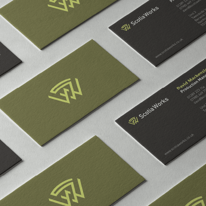
(04) Brand Patterns
Brand patterns created out of the logo monogram. These were used throughout the rest of the materials to more strongly brand the identity.

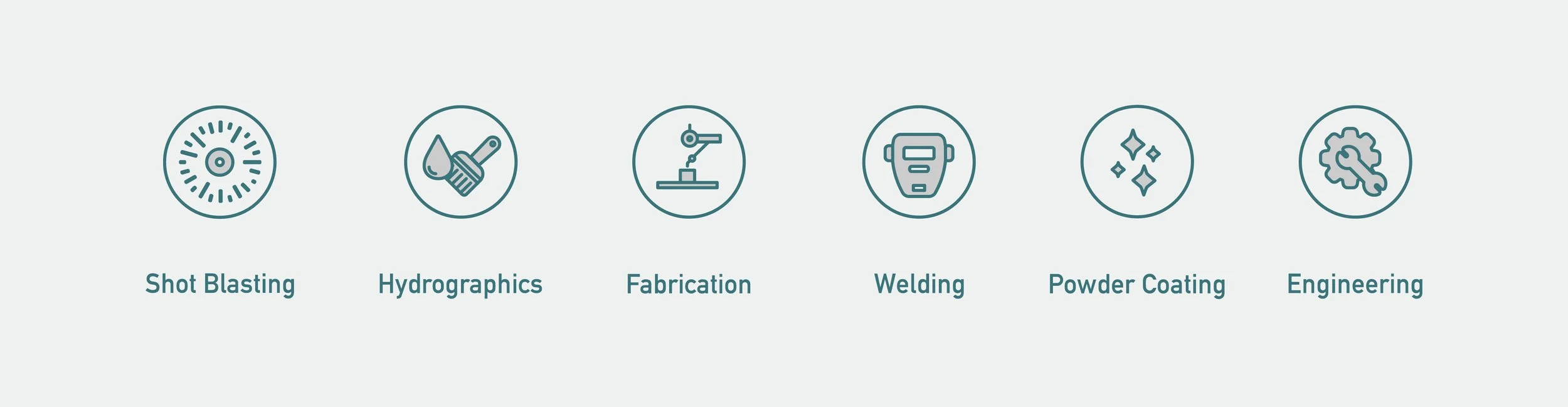
(05) Iconography
Scotia Works icon set to visually explain their full range of service offerings.
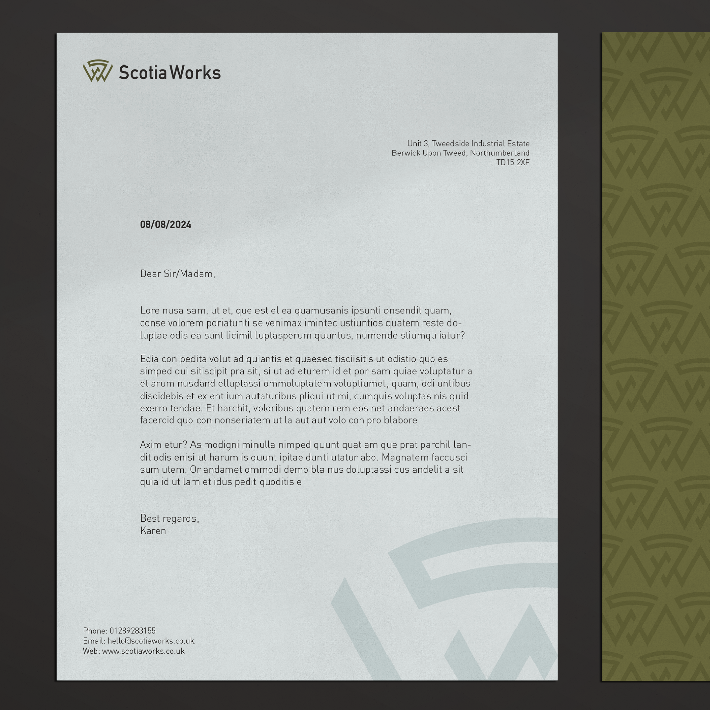
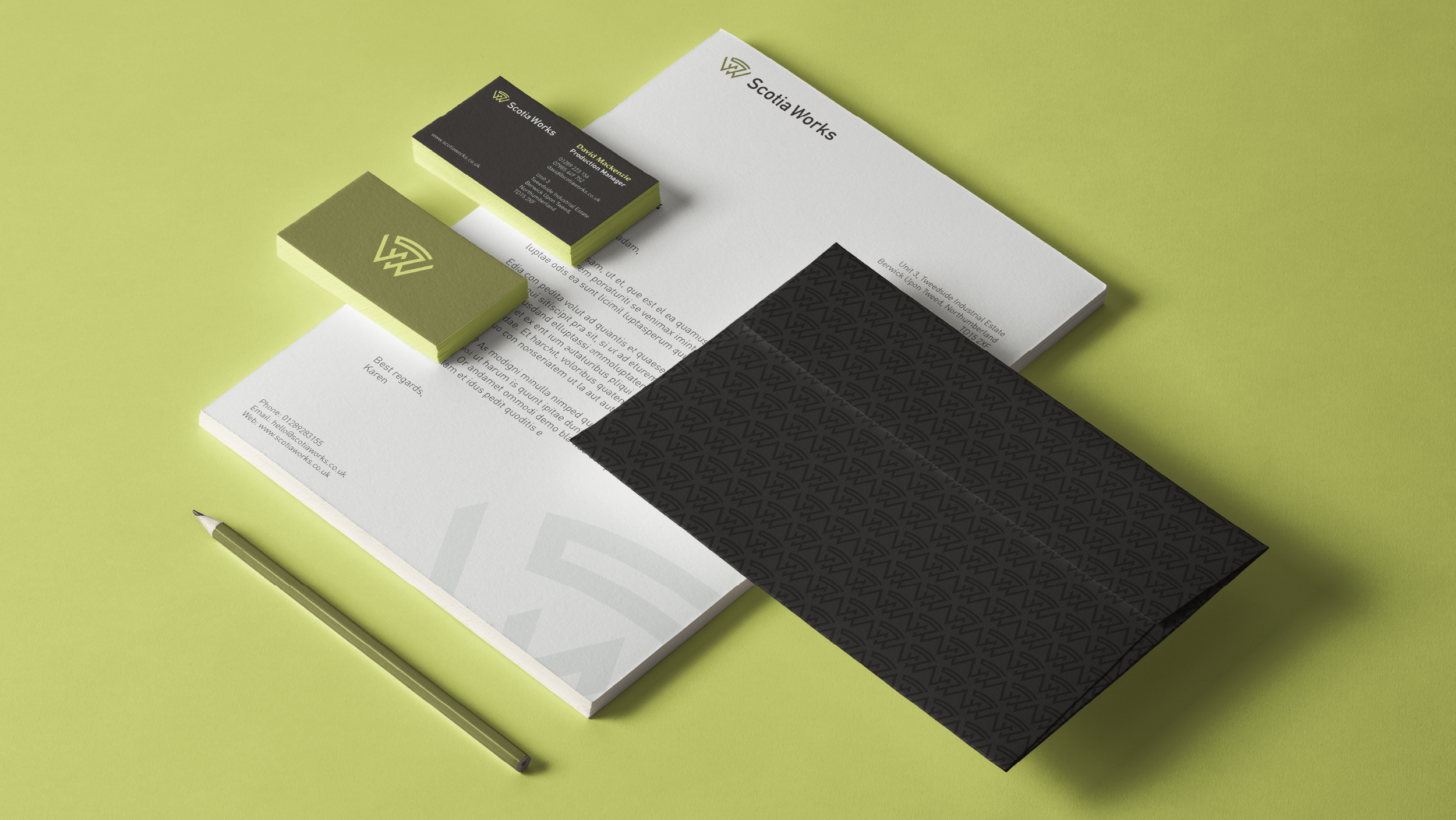
(06) Stationery