café sonder
Brand identity design for a Scottish café and events space.
(01) Creative Direction Concept
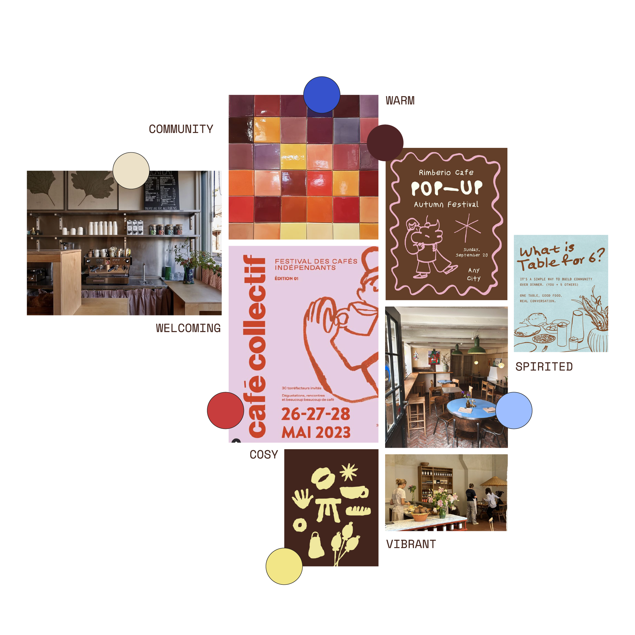
Café Sonder is created for community-minded locals who value connection, quality, and culture in their everyday lives. The moodboard was crafted based on this foundational brand mission alongside images the client shared.
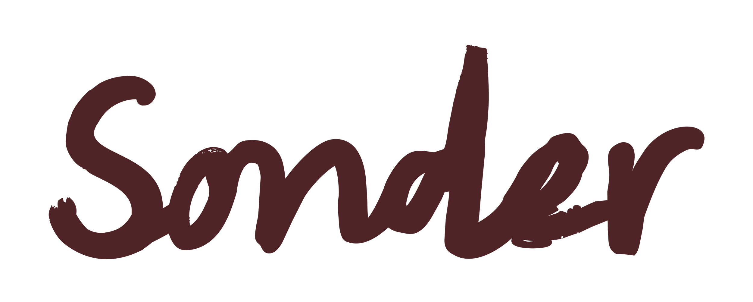
(02) Logo Suite
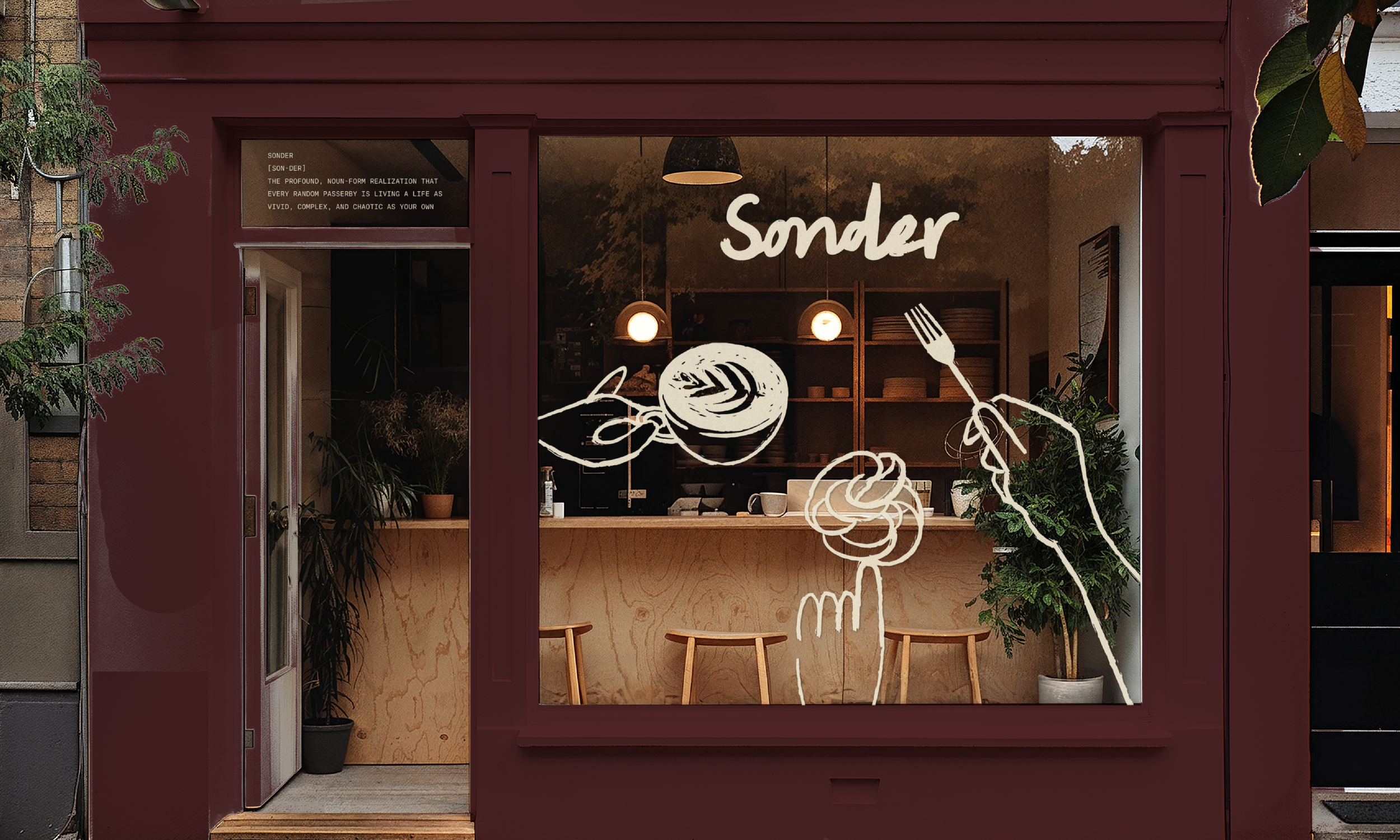
The primary Café Sonder logo has been created using a handwritten font to convey friendliness and authenticity.
Each letter joins to the other to symbolise connection and community; key values of the Café Sonder experience.
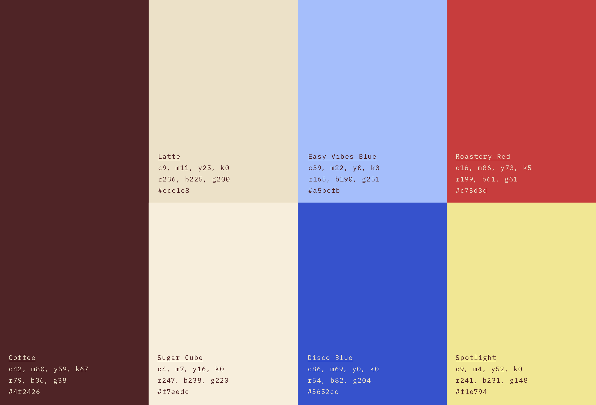
(03) Colour Palette
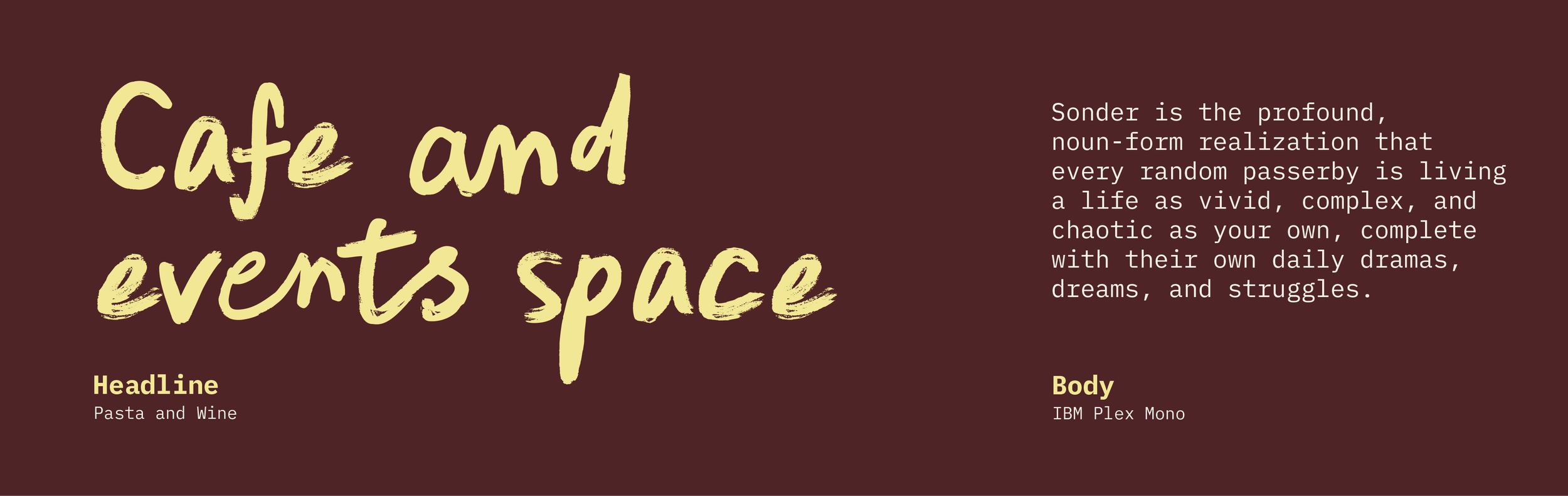
(04) Typography
Pasta and Wine has been chosen for it’s mix of authenticity and character. You will need to license it for business use.
IBM Plex Mono pairs well with Pasta and Wine while shining on it’s own for it’s simple but edgy feel.
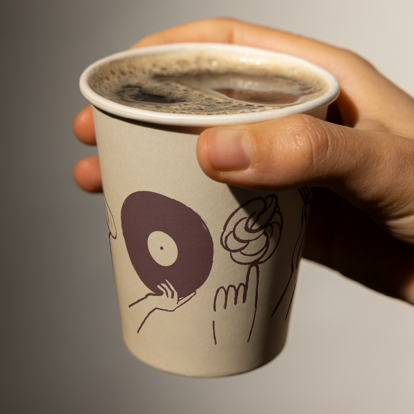
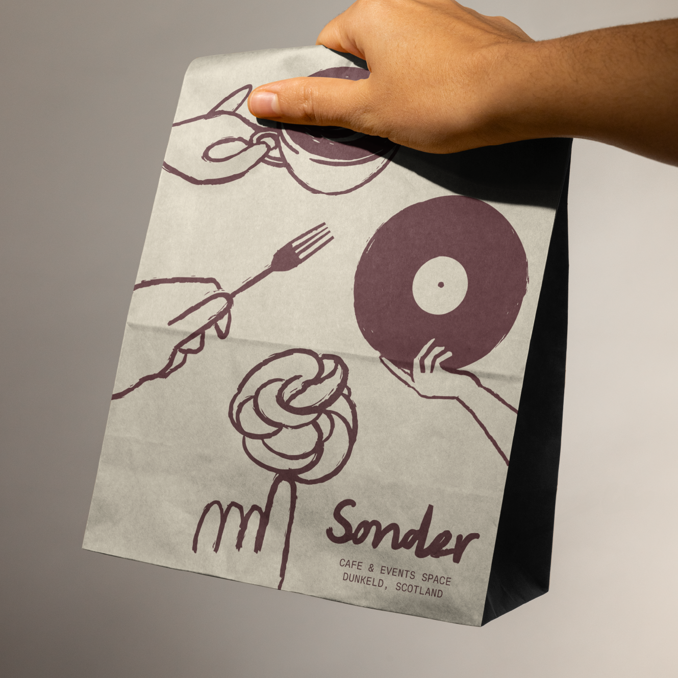
(05) Illustrations
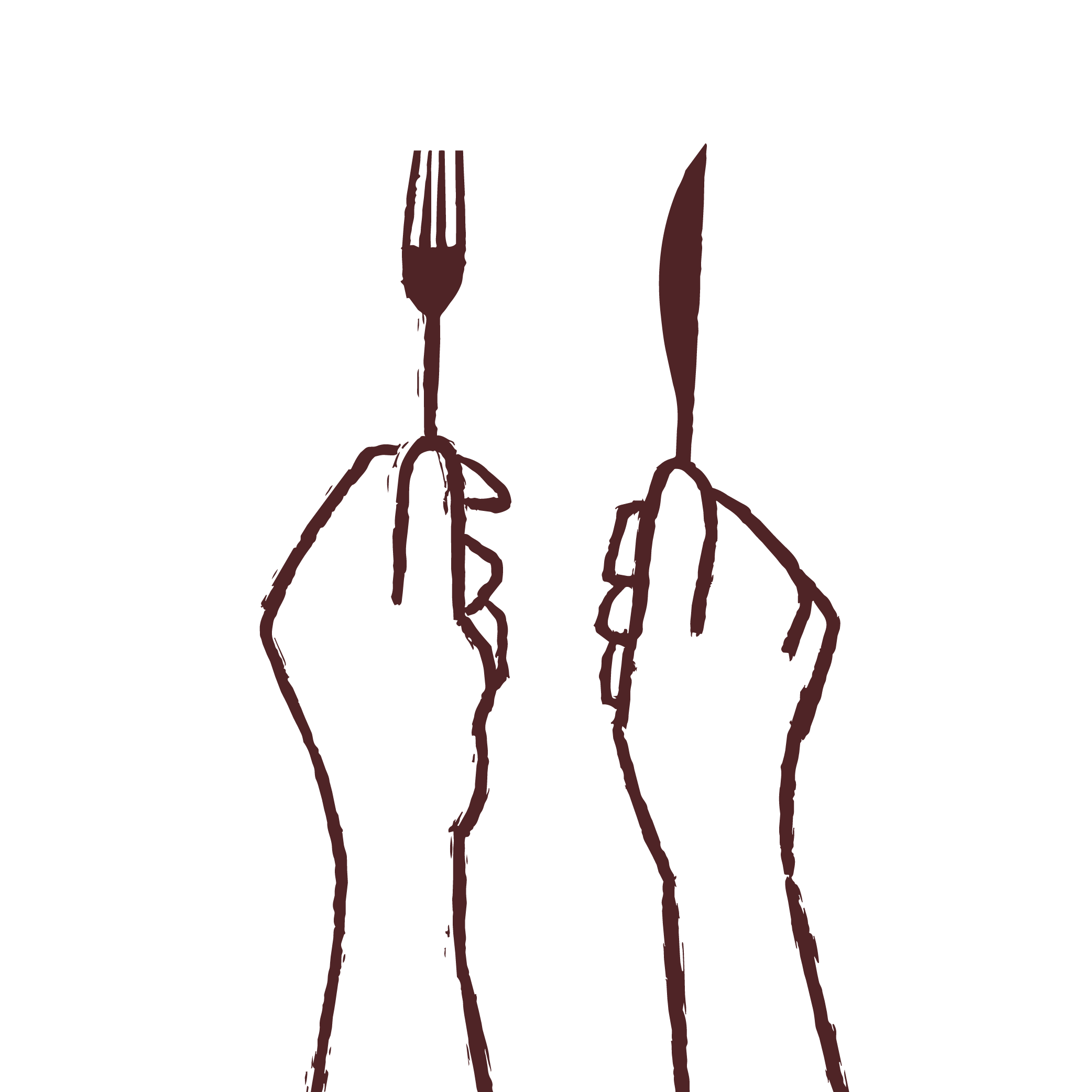
The Sonder illustration style features a range of items (food, drinks and events related) all being held in-hand. They are hand-drawn and completely unique to Sonder.
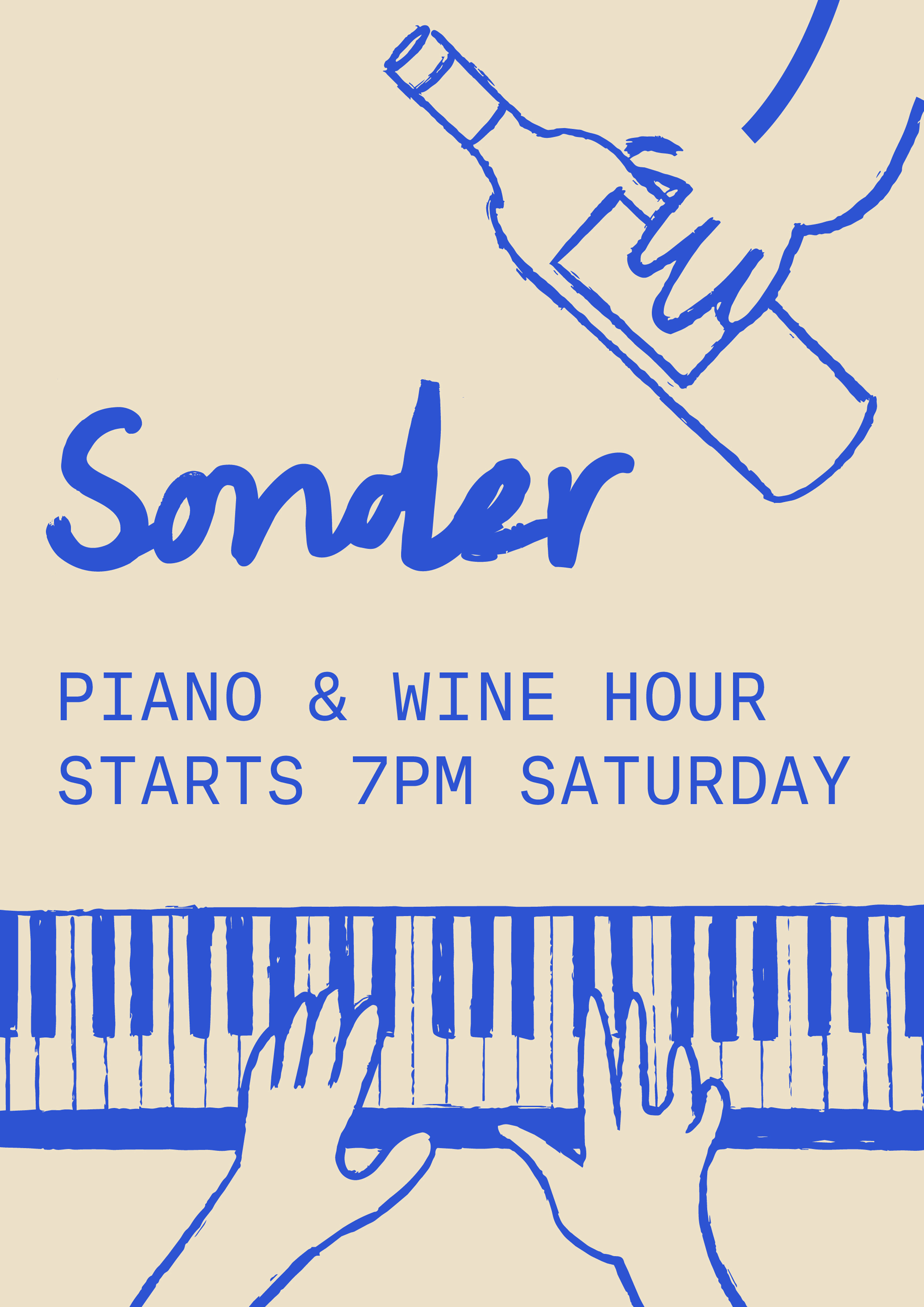
(06) Event Posters
Getting the event posters right was an important part of this project. Combining the hand-drawn illustrations with simple type meant the cafe could easily create eye-catching advertisements themselves.
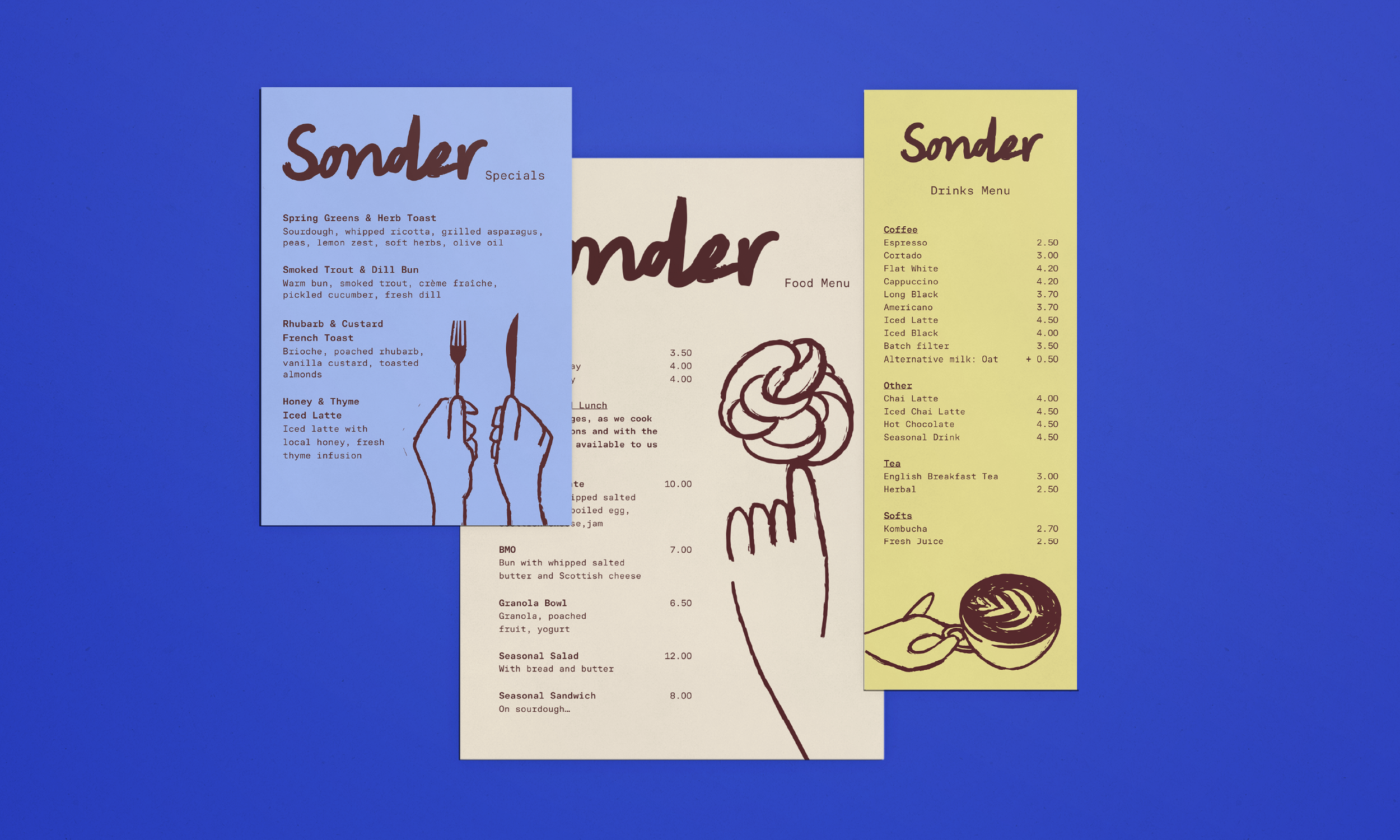
(07) Packaging and Menu Designs