a house collection
Brand identity design for a company renovating and selling shares in heritage properties.
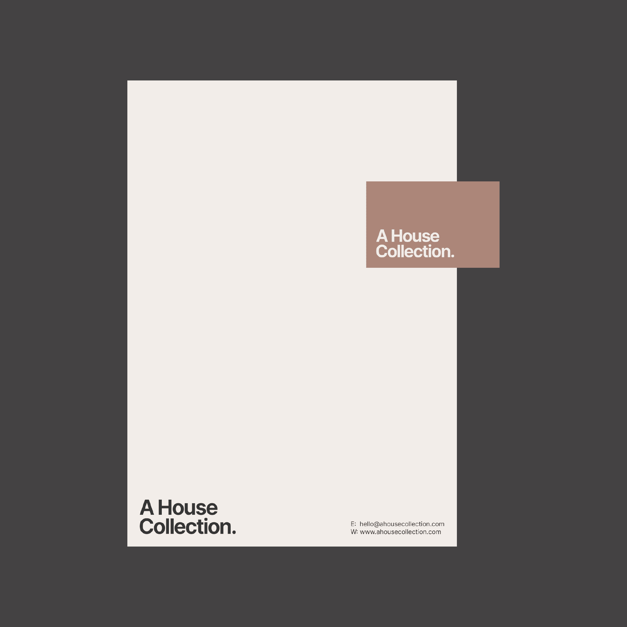
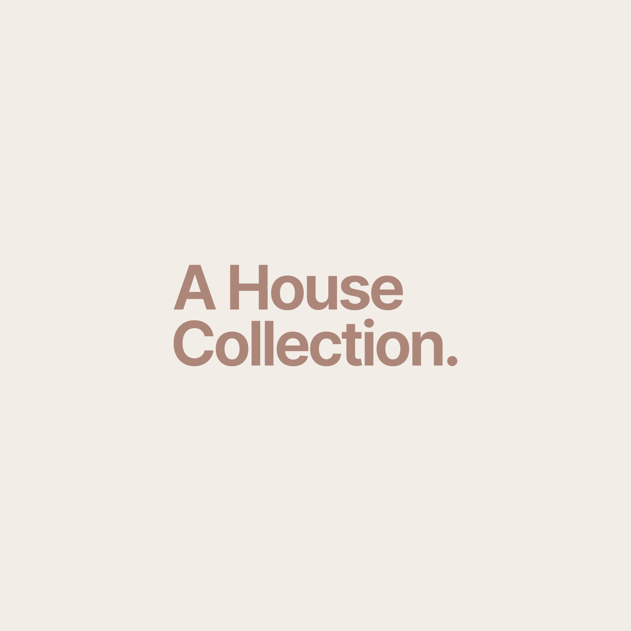
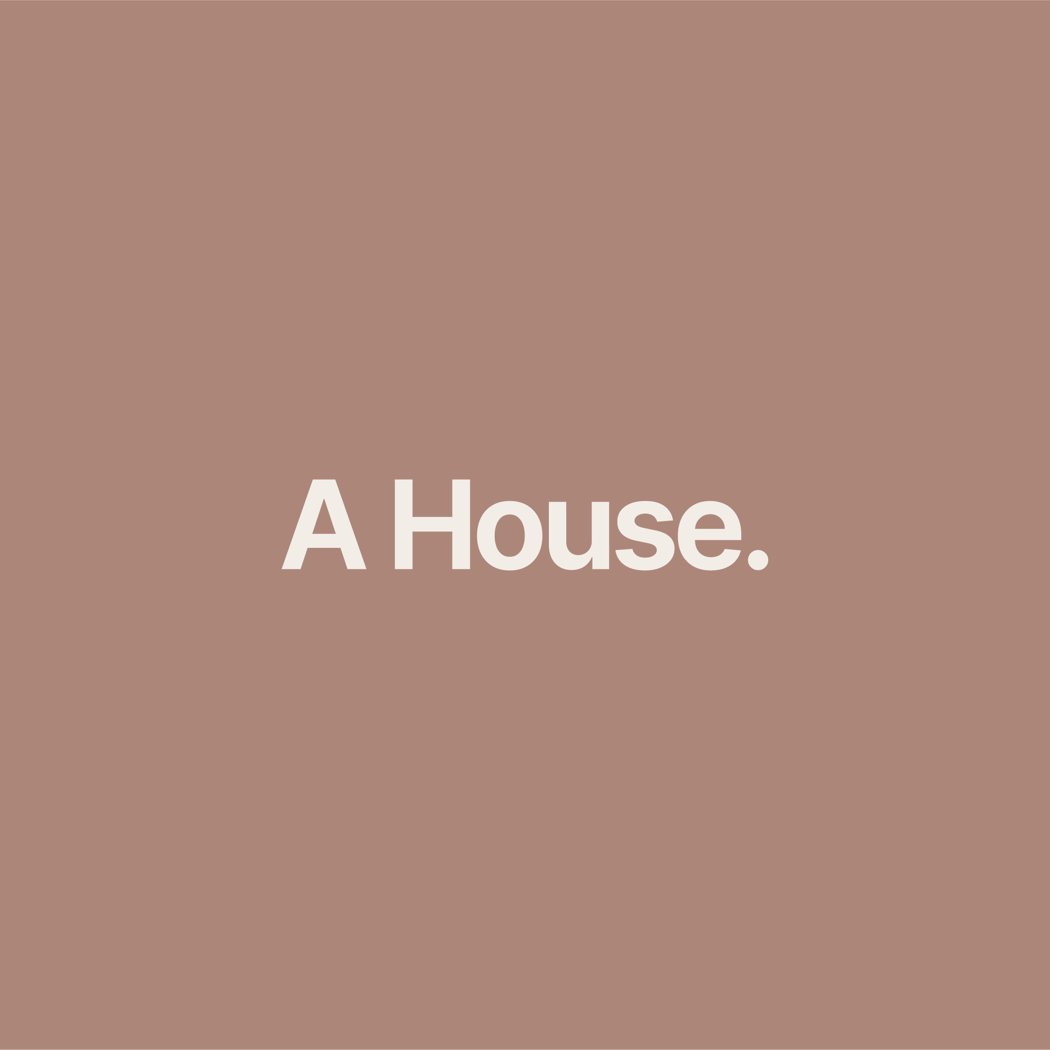
(01) Logo Suite
A House Collection logo has been kept simple, and that restraint is part of its strength. The wordmark reflects the integrity required to restore heritage architecture successfully, avoiding unnecessary ornamentation and mirroring the brand’s philosophy: historic homes carefully renovated for modern life. By remaining minimalist, the logo allows architecture, materials, and craftsmanship to take centre stage.
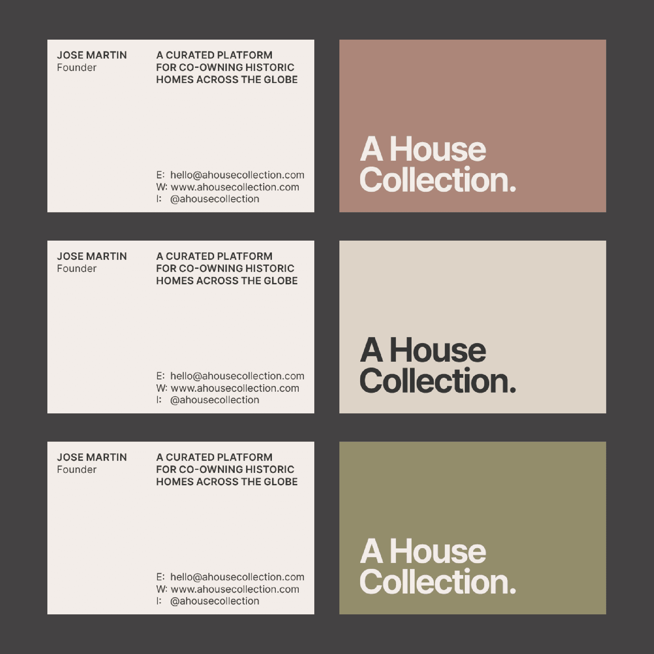
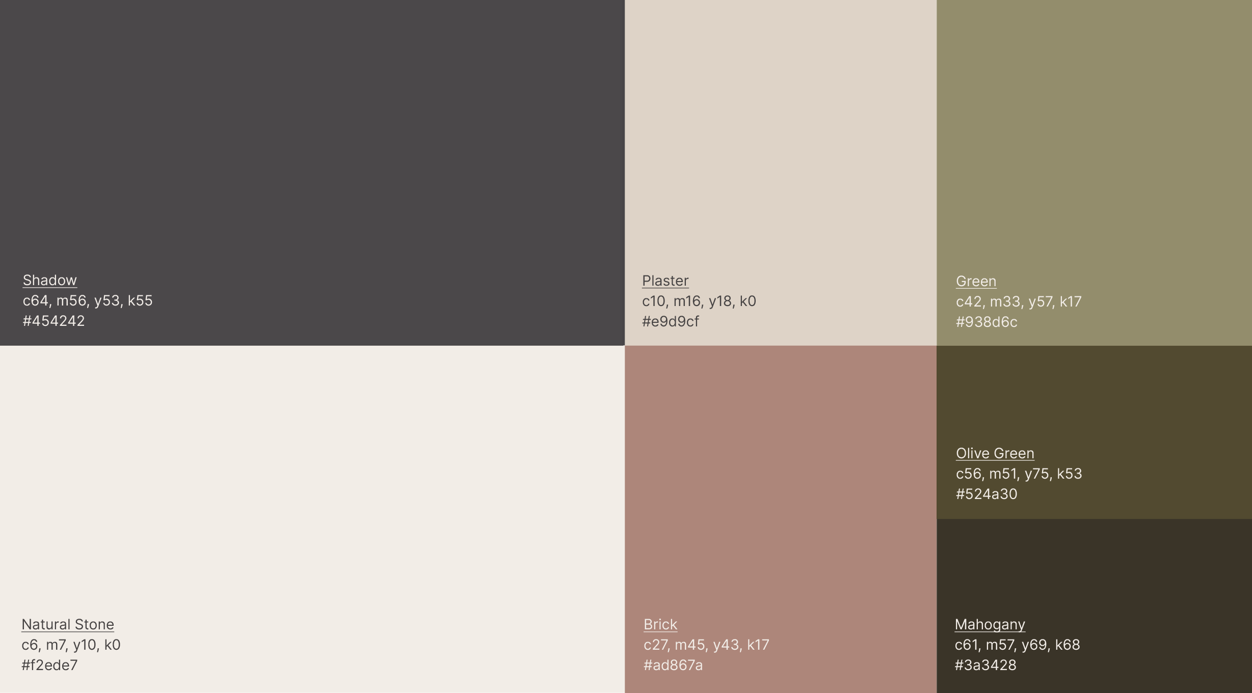
The colour palette is intentionally muted and material-led. Each tone is drawn from finishes commonly found in heritage architecture, reinforcing the brand’s connection to historic homes adapted for modern life.
Together, these colours create a palette that feels calm, assured, and timeless. There is no reliance on high contrast or trend-led colour; instead, the tones work harmoniously, much like the careful renovation of a historic home.
(02) Colour Palette
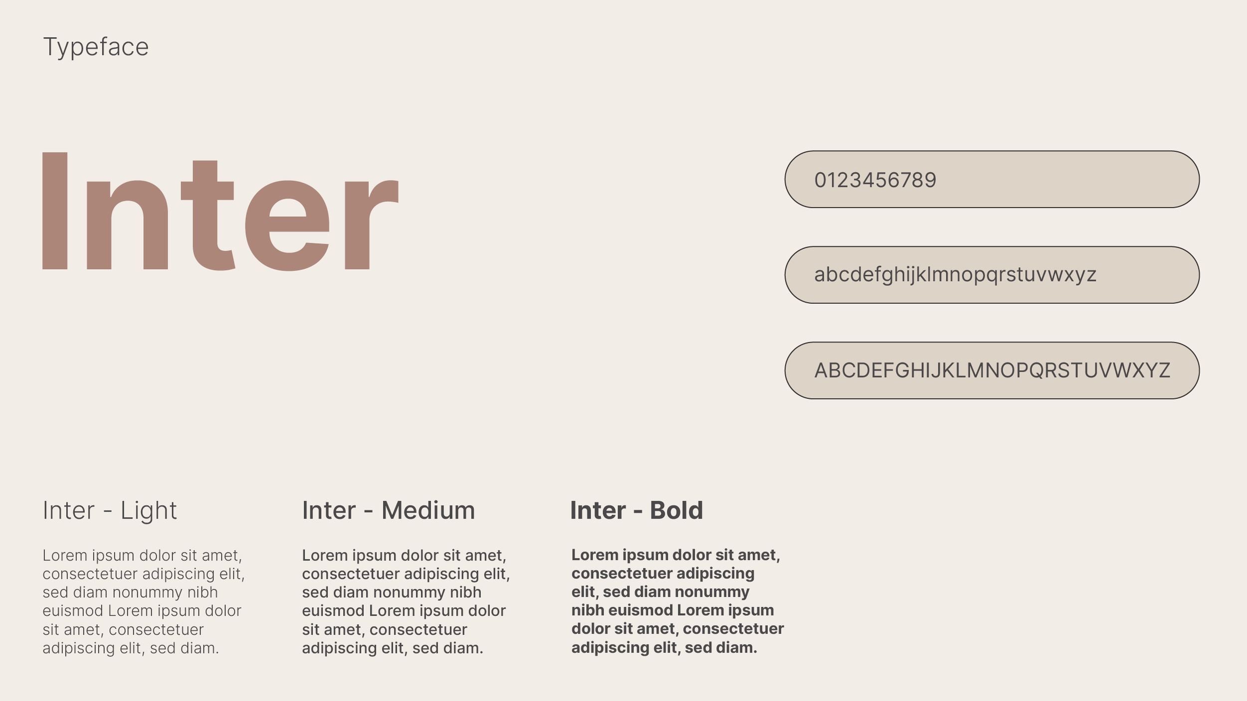
(03) Typography
Inter is a modern, royalty free type-face designed by Google.
While the homes themselves are rooted in history, this font signals modern thinking, care, and clarity.
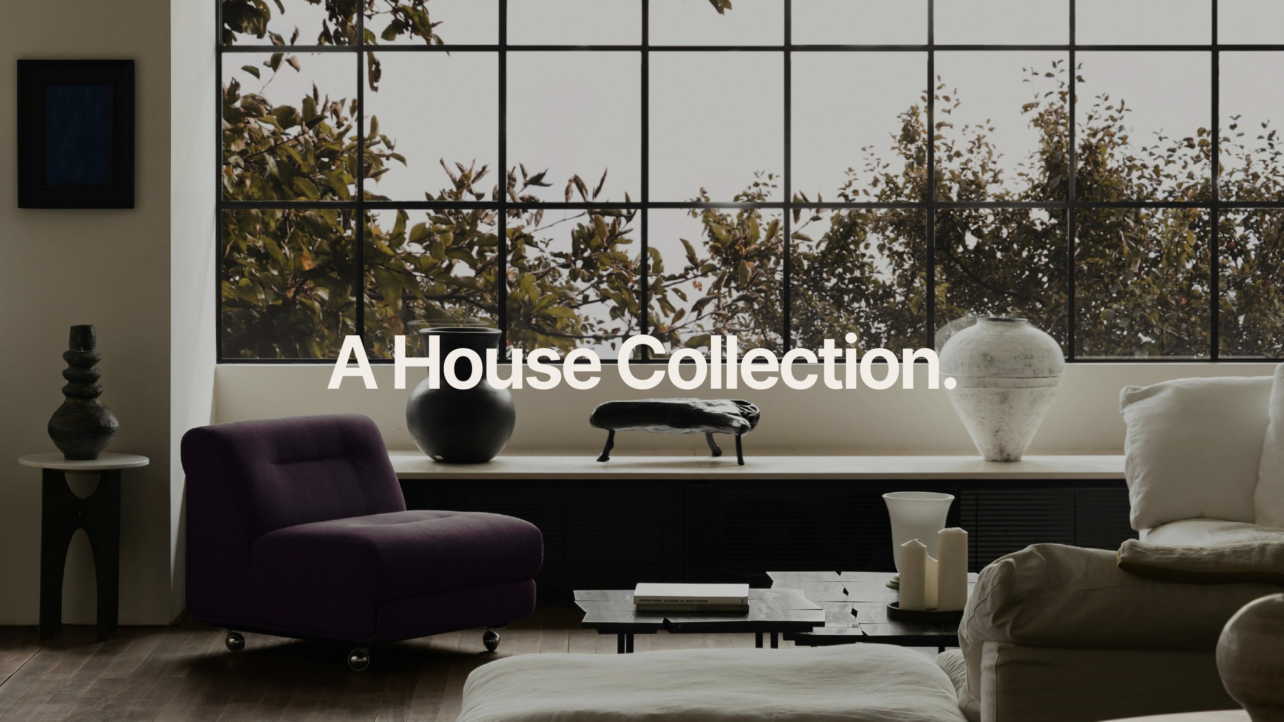
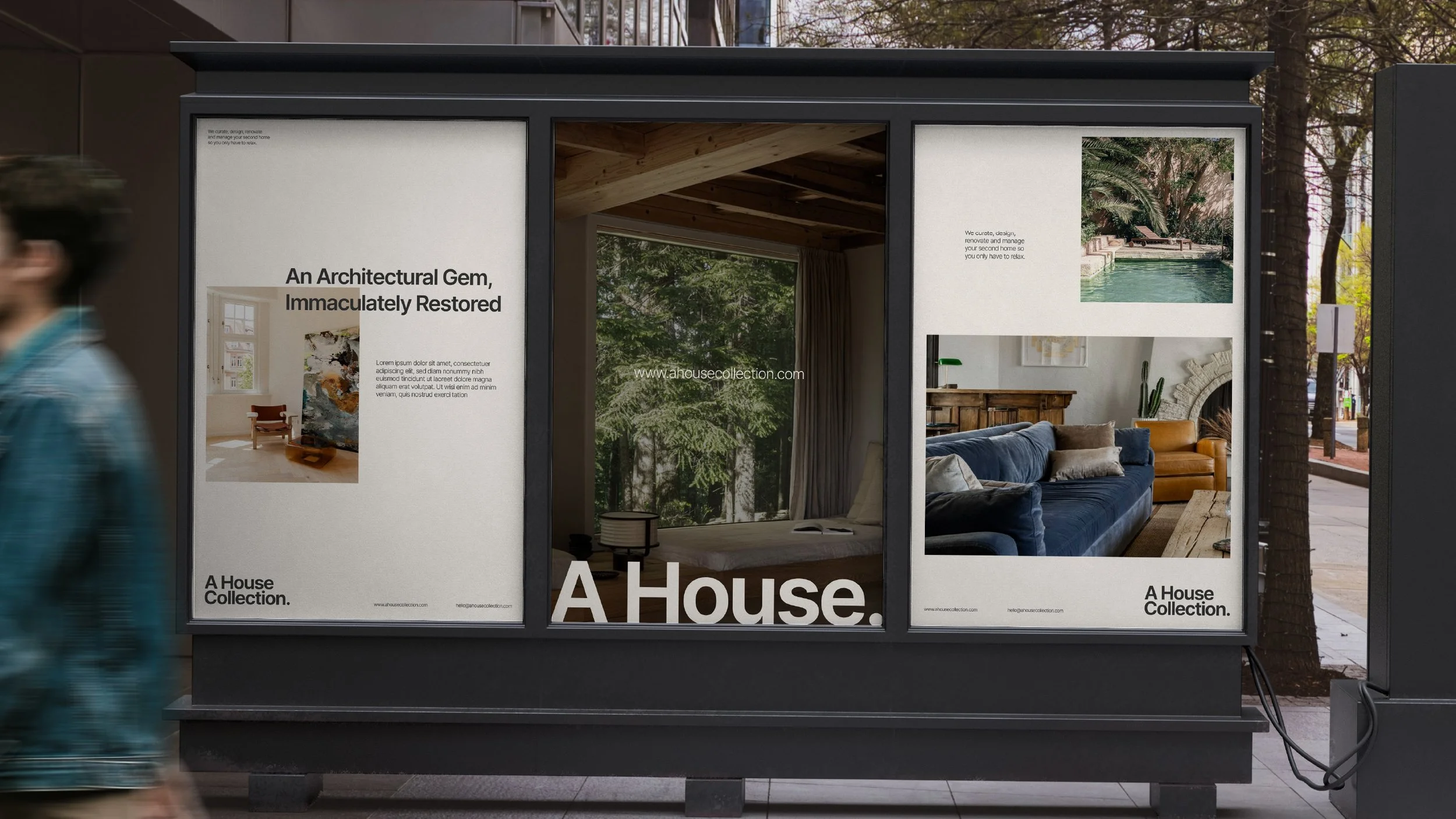
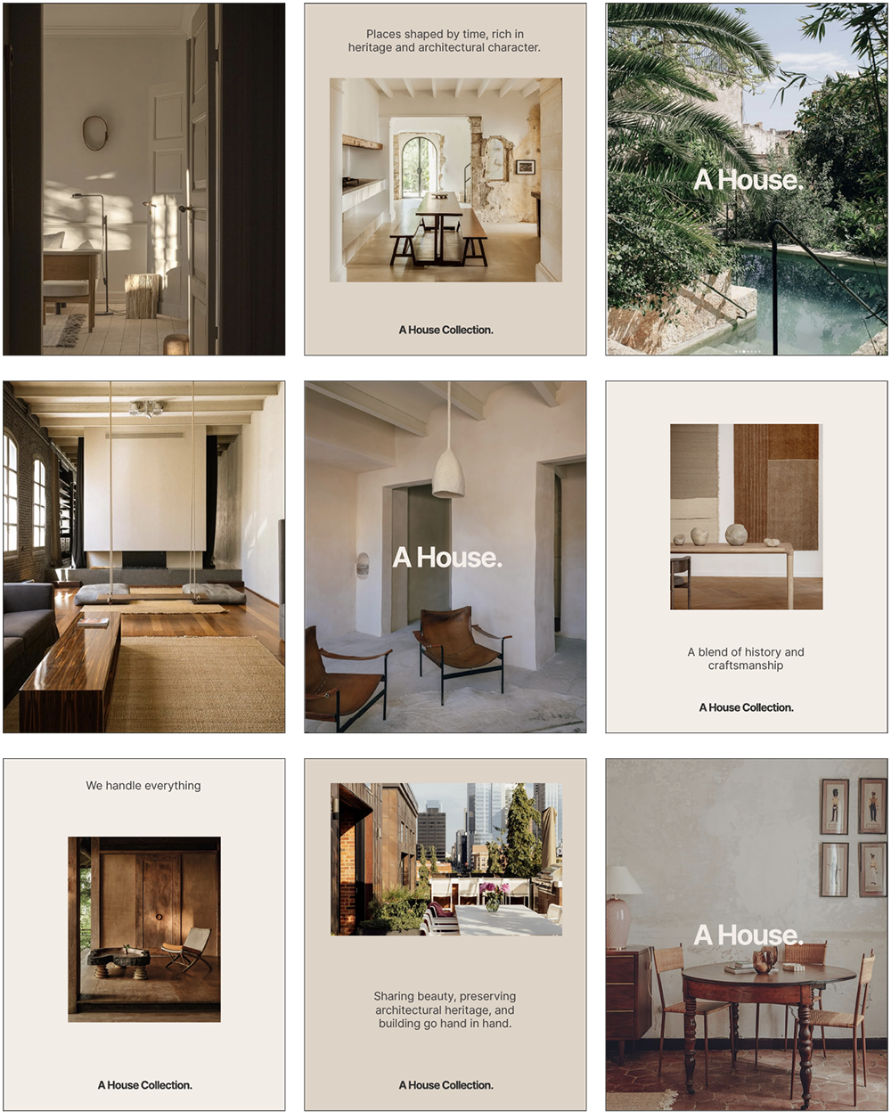
(04) Social Media
Featuring beautiful homes and using minimal text for a gallery like feel overall.
(05) Stationery