
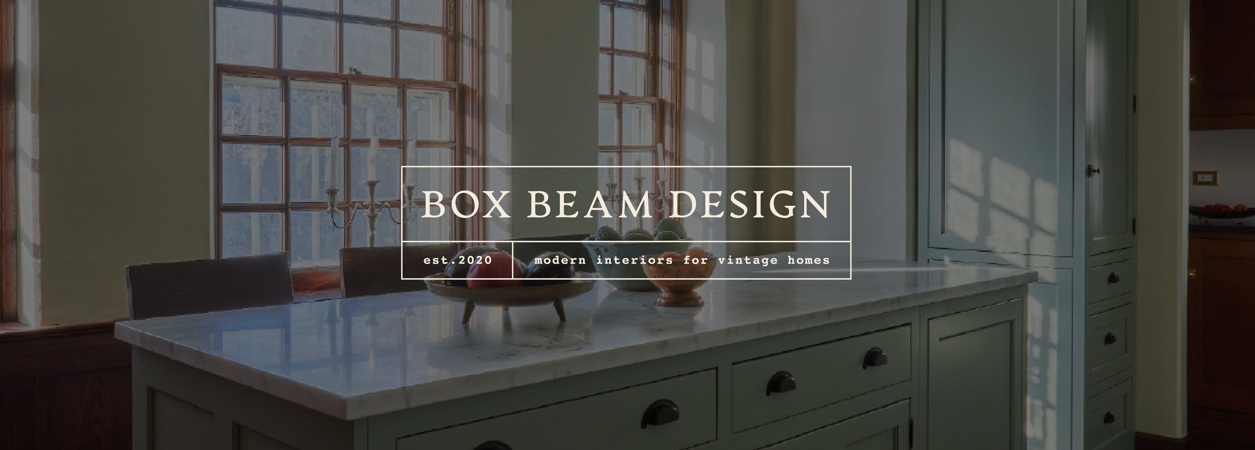
Box Beam Design
Brand identity for an interior designer based in Chicago who specialises in creating functional yet beautiful spaces for historical homes.
(01) Creative Direction Concept
As this client specialises in designing interiors for historic properties, I put together a mood-board that featured classic fonts, vintage imagery, and a muted colour palette. This communicated an elegant vibe that would look good but wouldn’t compete for attention with the interior work.

(02) Logo Suite
The logo suite makes use of a classic yet characterful serif font that references a more vintage age. This is paired with the mono font which helps to add a touch of modernity to the brand (mixing old with new - much like the interior design service the client offers).
I also created secondary marks featuring the clients beautiful interior work. These secondary logos should only be used where space allows as otherwise the materials may look too busy.

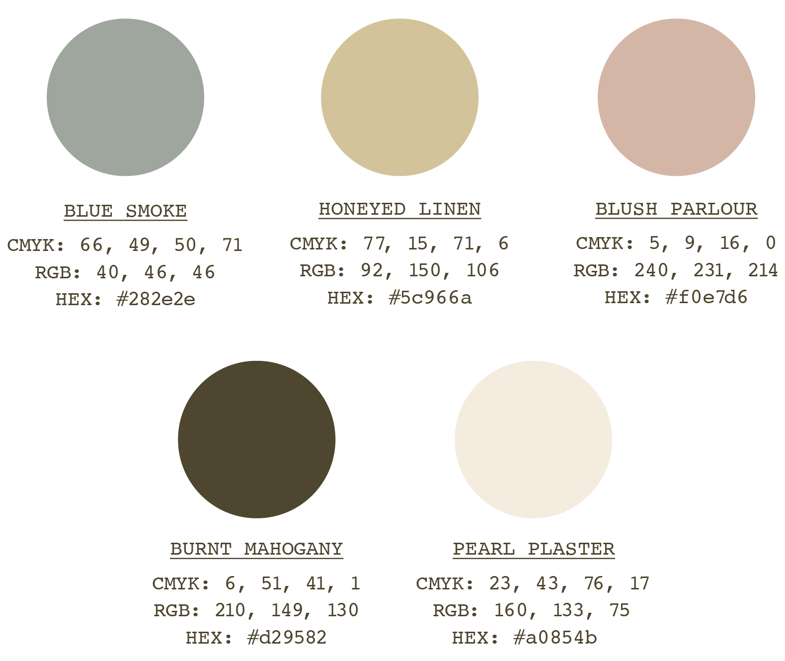
The colour palette is inspired by the home interiors of years gone by - no garish paint colours featured here, only muted, complementary tones.
(03) Colour Palette
(04) Typography
A classic yet characterful serif font that references a more vintage age. This is paired with the mono font which helps to add a touch of modernity to the brand (mixing old with new - much like the interior design service the client offers).

(05) Illustrations

The typeface chosen is reminiscent of a plant growing wildly, featuring curved letterforms that together combine to create a bold feel. Futura off-sets this by being clean, crisp and legible.
(06) Brand Pattern
Brand patterns based on a found tile pattern from the 1900s.


(07) Brand Assets
The main brand asset for this project was a website designed and built in Squarespace.


