ploof dog pantry
Brand identity, packaging designs, UX application design and a website design + build for a mobile dog treats business.
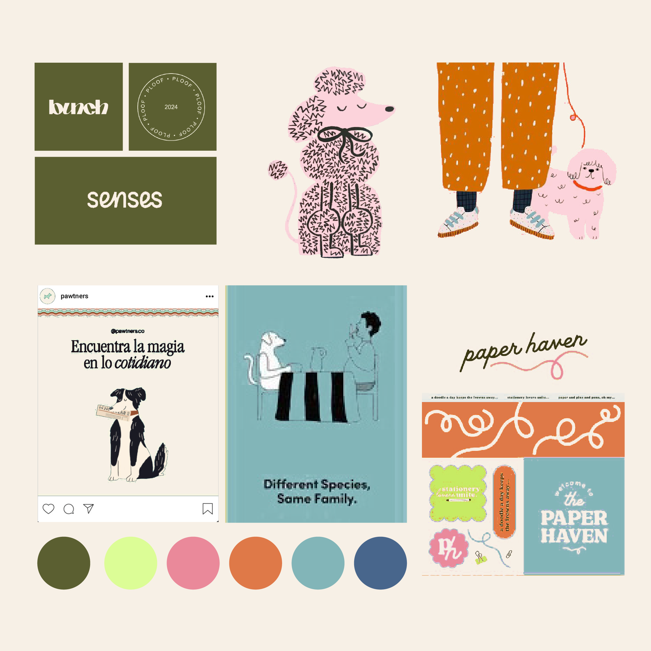
(01) Creative Direction Concept
This moodboard encapsulated everything Ploof was to be about as a brand: fun, joy, playful, free and happy.
(02) Logo Suite
The logo suite features a custom word-mark designed to suggest the playful movement of a excitable dog.
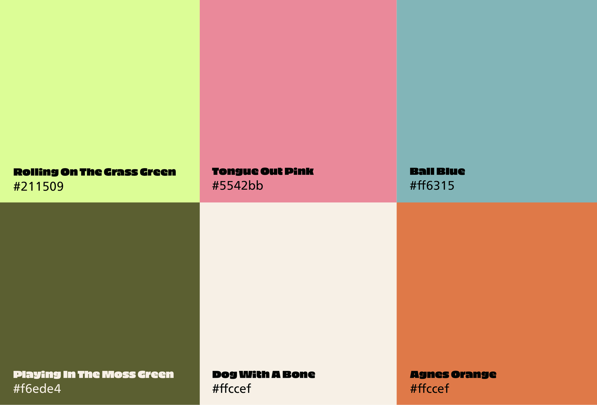
A colourful palette was created based on all things happy dog.
(03) Colour Palette
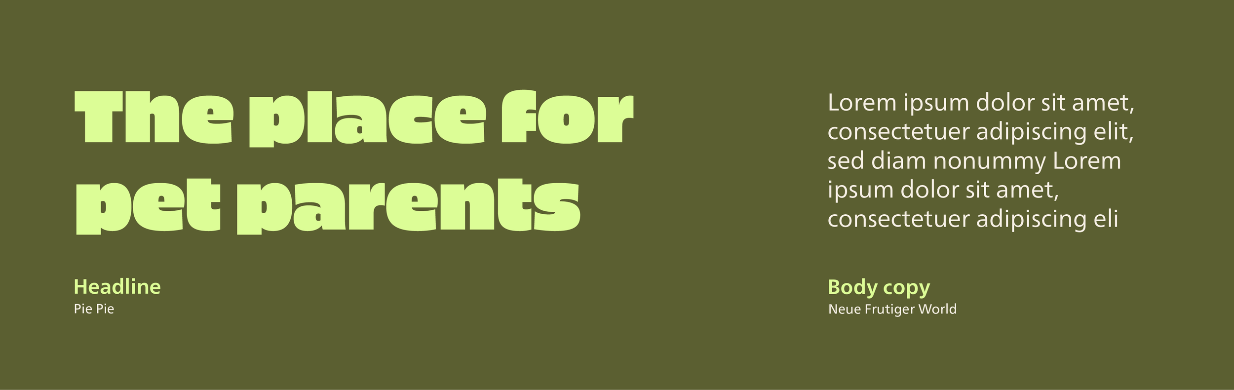
PiePie was chosen for it’s playful aesthetic, while Neue Frutiger complements it by being cleaner, quieter and more legible for body copy.
(04) Typography
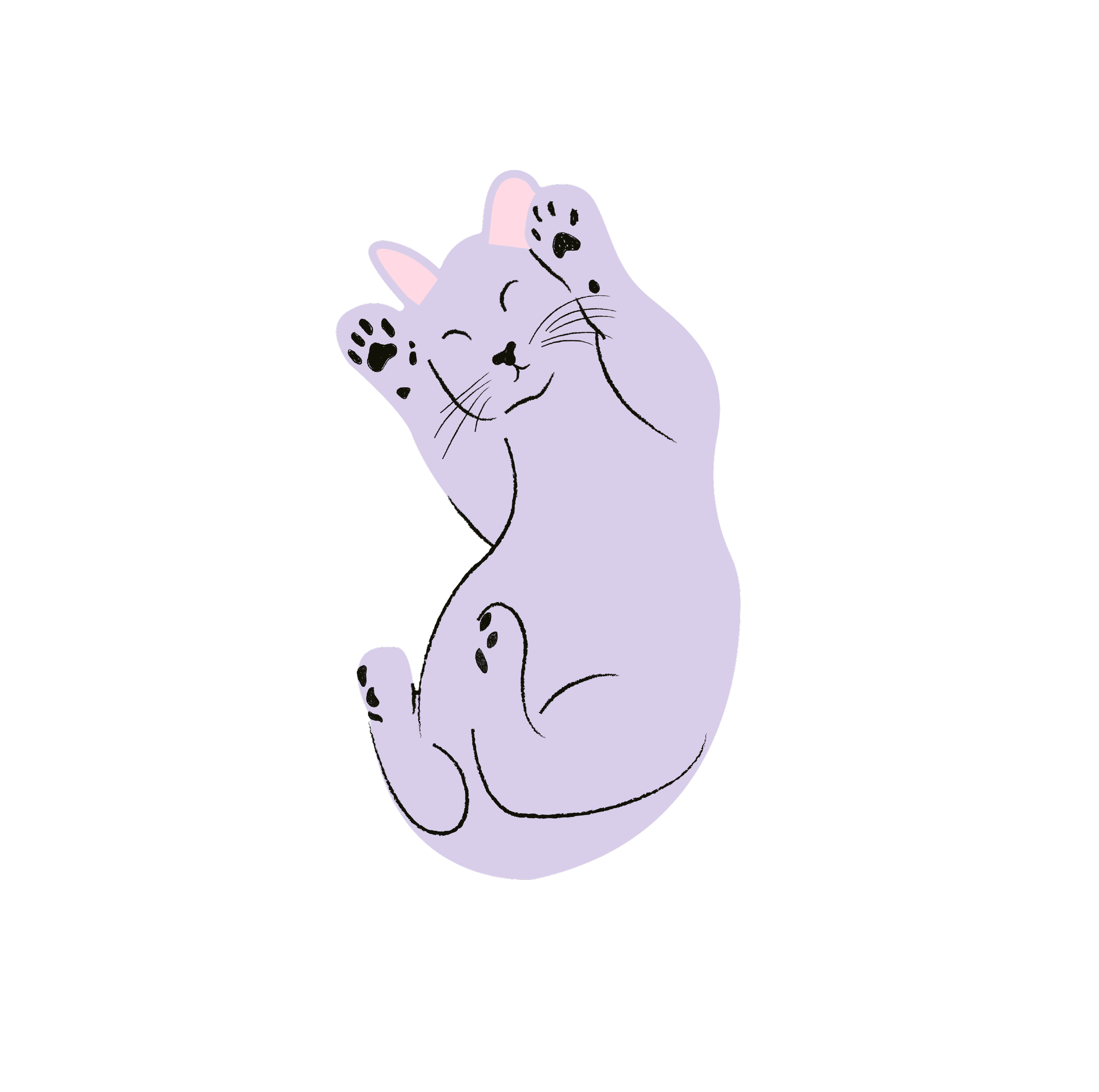
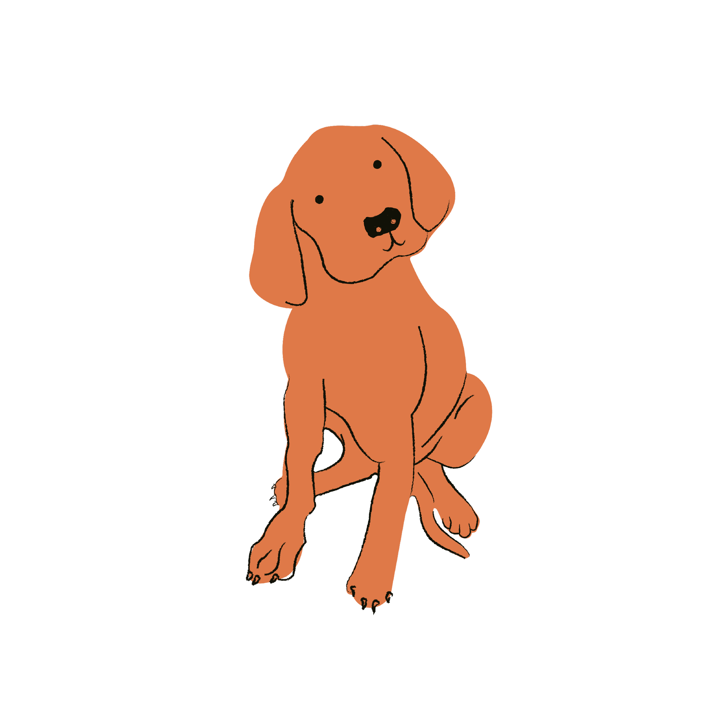
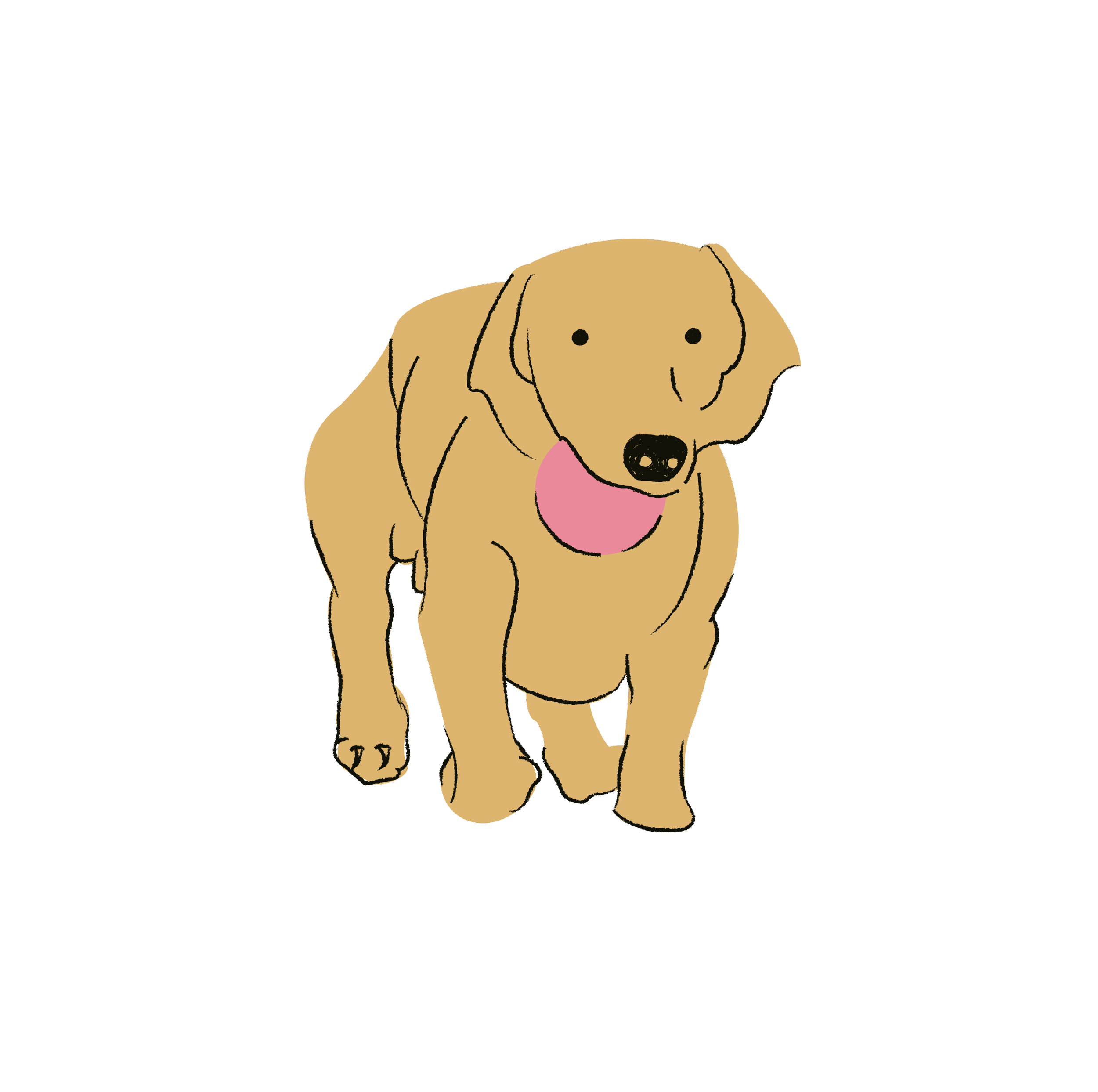
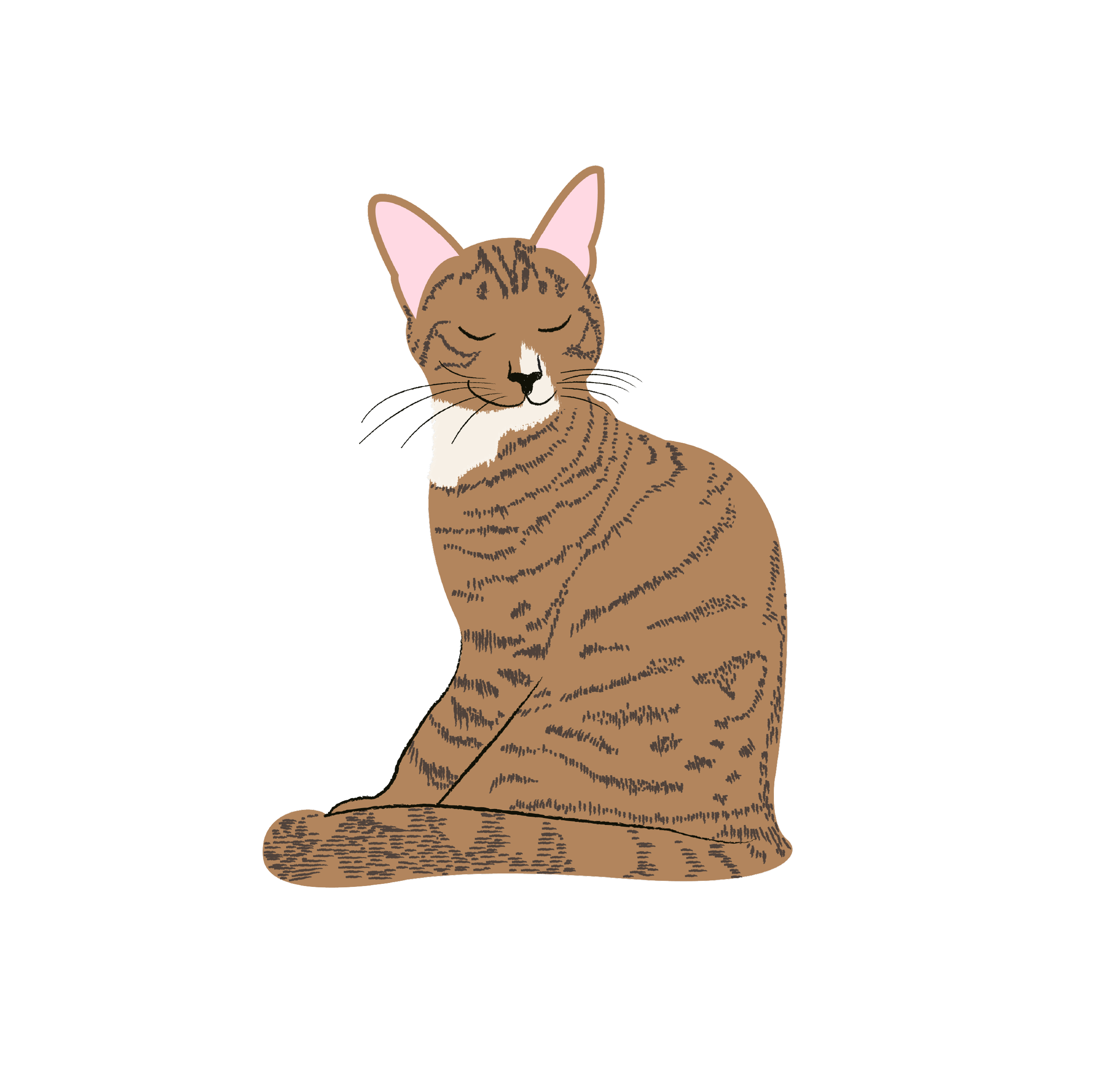
(05) Illustrations
These hand-drawn illustrations were created to add further personality and fun to the brand.
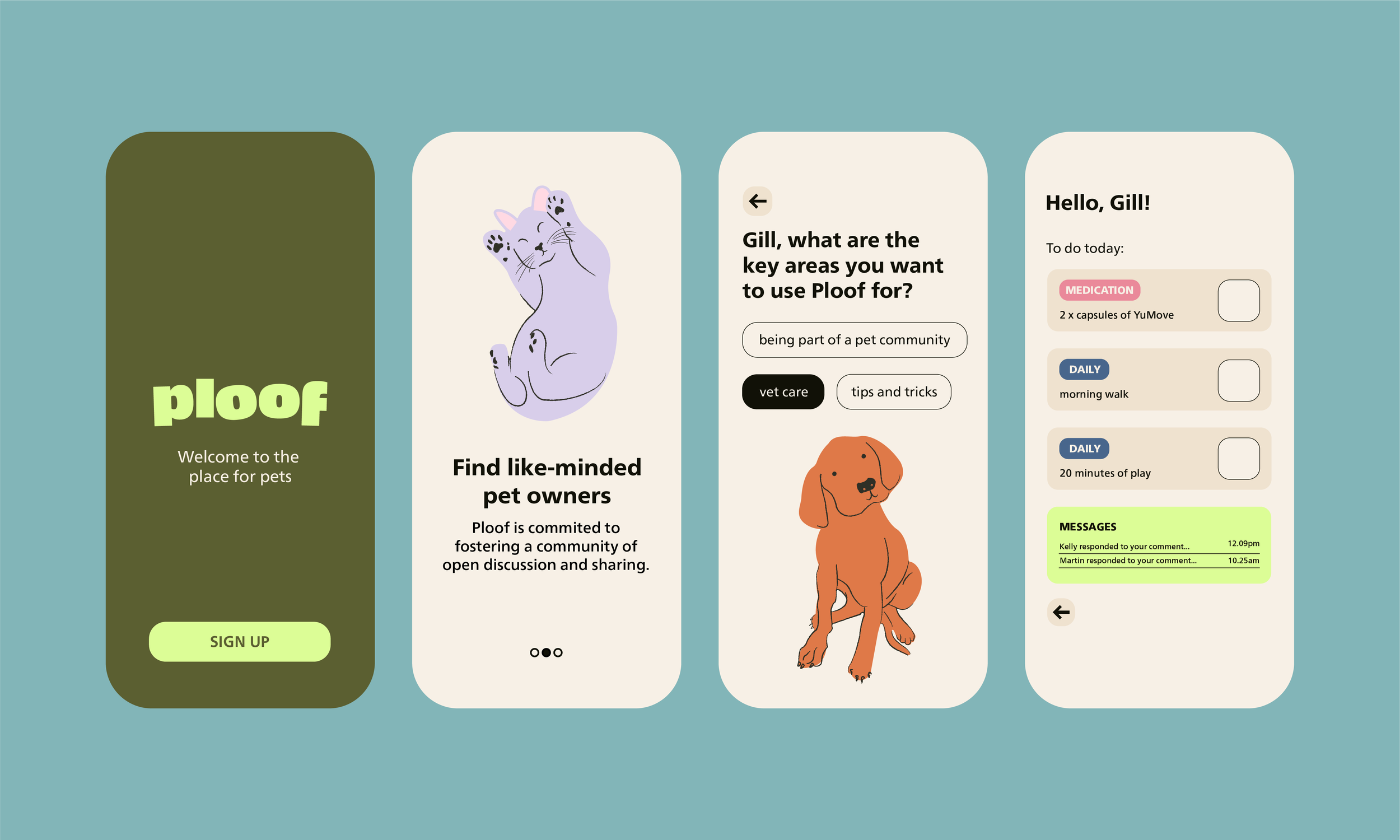
(06) Application UX Design
When this brand was originally in conception, there was talks of a app being created to support pet owners in all areas of pet life. Eventually this app didn’t come into play, but we did get to the wire-framing stage.
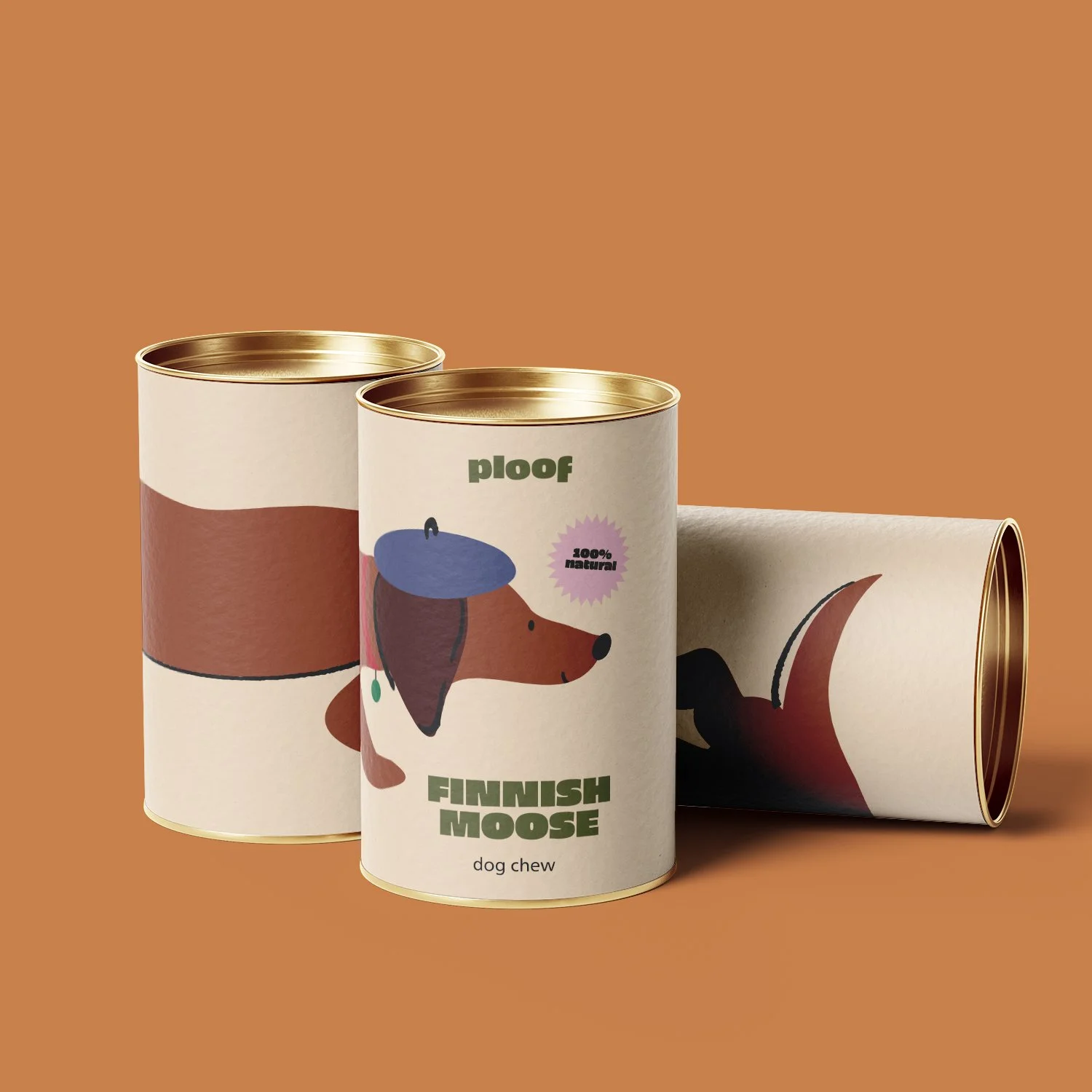
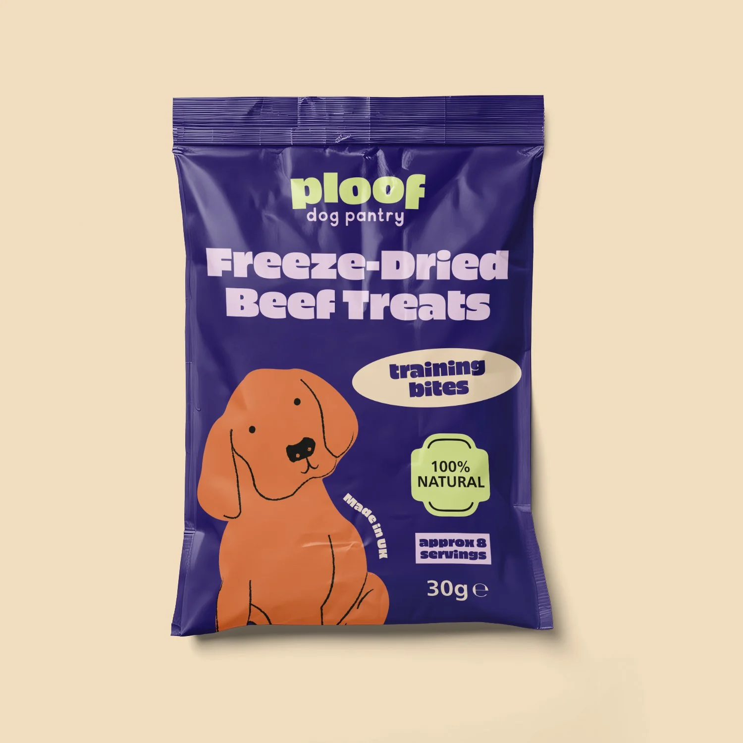
Illustrated packaging designs for Ploofs first range of dog treats.
(07) Dog Chew Packaging