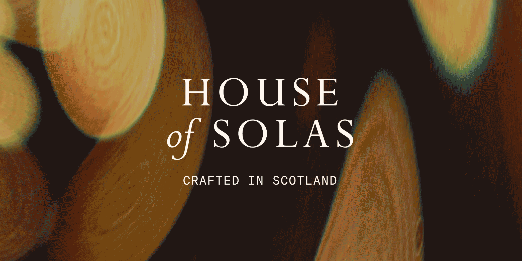
house of solas
(WHITE LABEL WORK)
Brand identity and packaging designs for a premium Scotland based candle business.
(02) Logo Suite
The House of Solas Logo was designed to be elegant and clean, making use of classic typography to communicate the brands premium nature and line of graceful scents.


The palette features four muted colours and two that pop, all inspired by the landscapes of Scotland. Together they combine for an overall feel of sophistication, while avoiding dullness.
(03) Colour Palette


(04) Typography
Perpetua is the main typeface, combined with a mono sans in areas to add a touch of modernity to the otherwise classic feel.
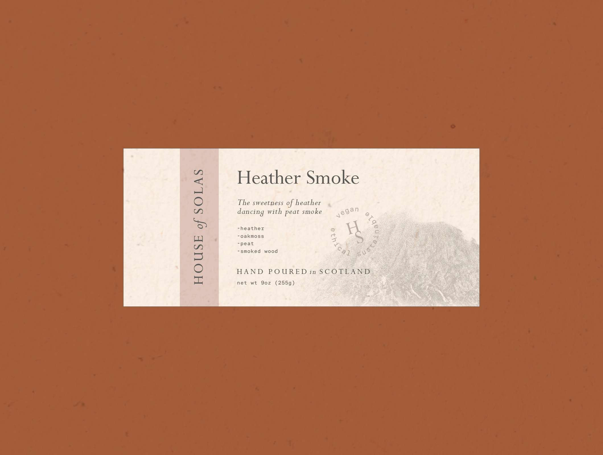
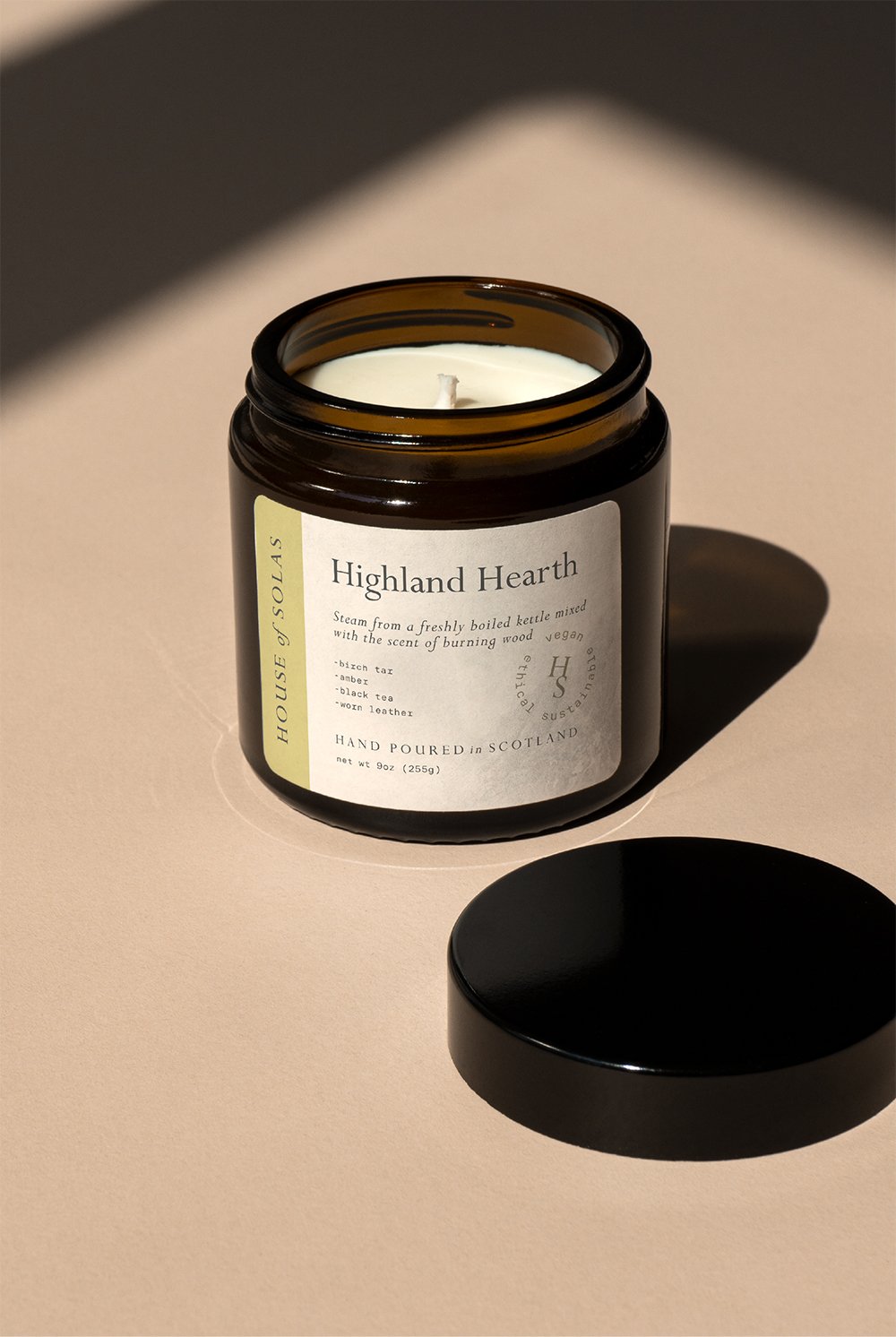
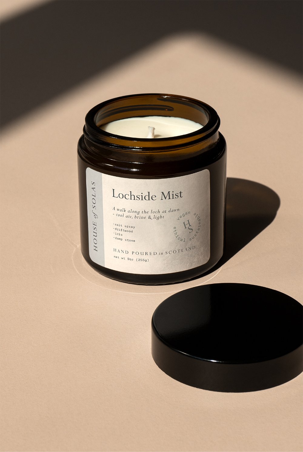
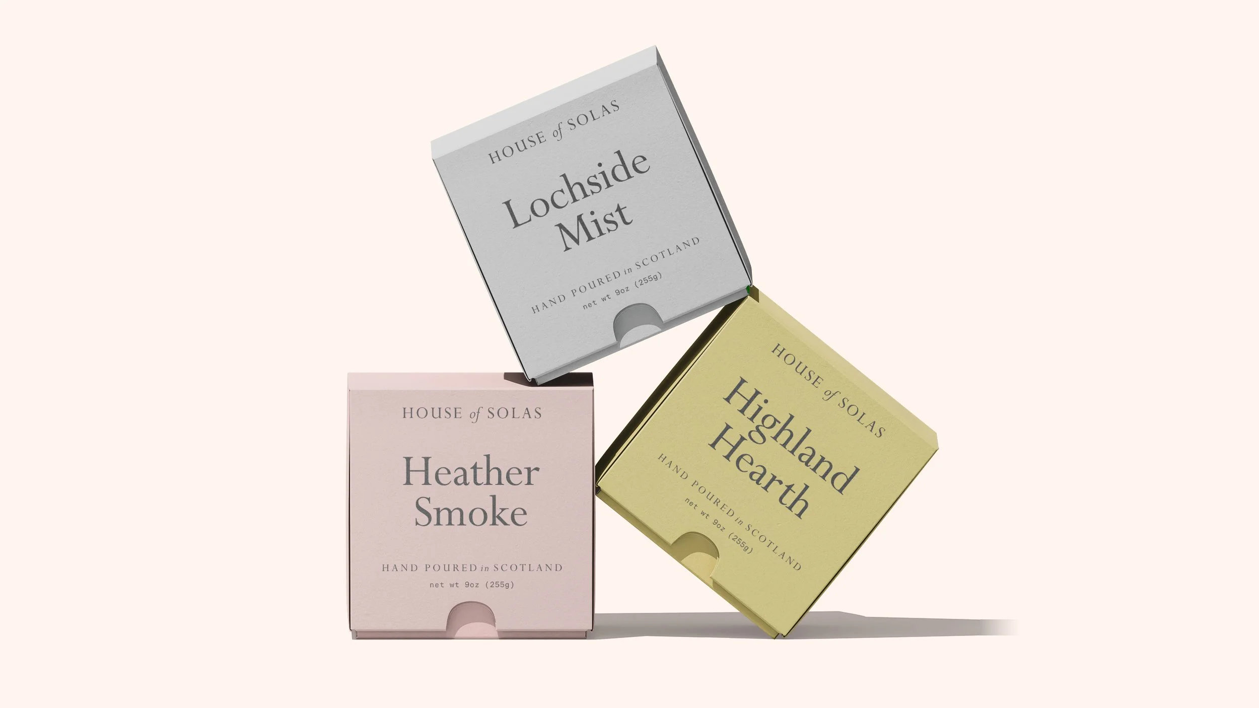
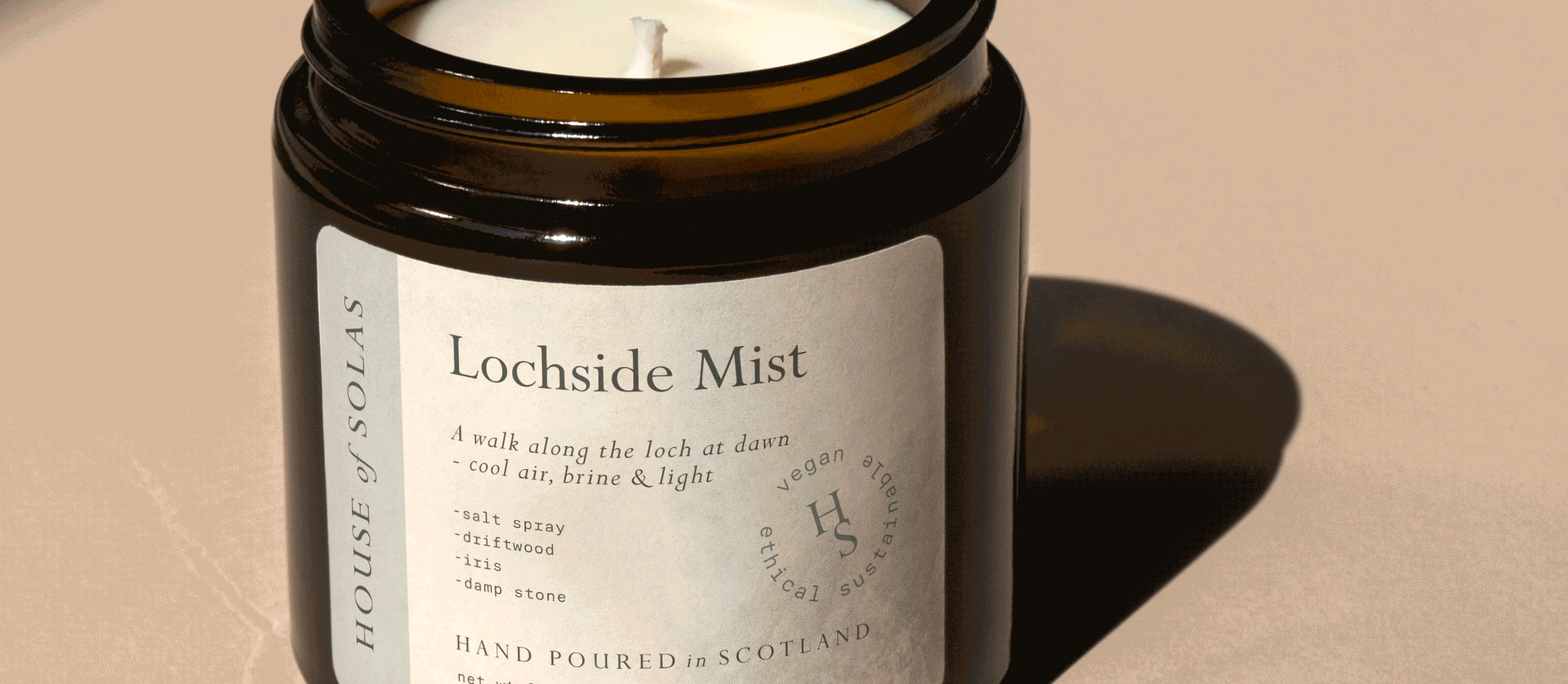
(05) Packaging
The premium nature of the brand was carried onto the packaging designs, focusing on a type-led approach combined with a subtle addition of colour.