Box Beam Design

Brand identity for an interior designer based in Chicago who specialises in creating functional yet beautiful spaces for historical homes.

(01) Creative Direction Concept

As this client specialises in designing interiors for historic properties, I put together a mood-board that featured classic fonts, vintage imagery, and a muted colour palette. This communicated an elegant vibe that would look good but wouldn’t compete for attention with the interior work.

A mood board with neutral tones, a river landscape photo, a watercolor painting titled 'Sense', a business card for Emily Baker, and various design elements related to home and interior design.

(02) Logo Suite

The logo suite makes use of a classic yet characterful serif font that references a more vintage age. This is paired with the mono font which helps to add a touch of modernity to the brand (mixing old with new - much like the interior design service the client offers).

I also created secondary marks featuring the clients beautiful interior work. These secondary logos should only be used where space allows as otherwise the materials may look too busy.

A promotional graphic for Box Beam Design featuring vintage-style interior design images and color swatches in muted tones, with text indicating the business established in 2020 and specializing in modern interiors for vintage homes.

The colour palette is inspired by the home interiors of years gone by - no garish paint colours featured here, only muted, complementary tones.

(03) Colour Palette

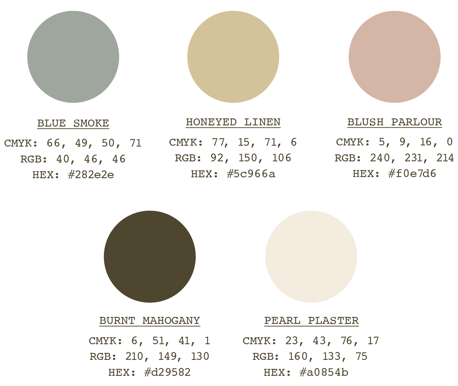
A color palette featuring six colors: Blue Smoke, Honeyed Linen, Blush Parlour, Burnt Mahogany, and Pearl Plaster, each with CMYK, RGB, and HEX color codes listed.

(04) Typography

A classic yet characterful serif font that references a more vintage age. This is paired with the mono font which helps to add a touch of modernity to the brand (mixing old with new - much like the interior design service the client offers).

Typography poster with large alphabet letters, headline, subheading, body copy, and different font styles on a dark background.

(05) Illustrations

An ornate vintage record player with a decorative grill and a turntable

The typeface chosen is reminiscent of a plant growing wildly, featuring curved letterforms that together combine to create a bold feel. Futura off-sets this by being clean, crisp and legible.

(06) Brand Pattern

Brand patterns based on a found tile pattern from the 1900s.
A pattern of beige tiles with star-shaped designs in darker beige.
Pattern of light green tiles with dark green star-shaped motifs.
Pattern of beige and light brown stars on a tiled background
Pattern of beige and light brown star shapes arranged in a grid on a cream-colored background.

(07) Brand Assets

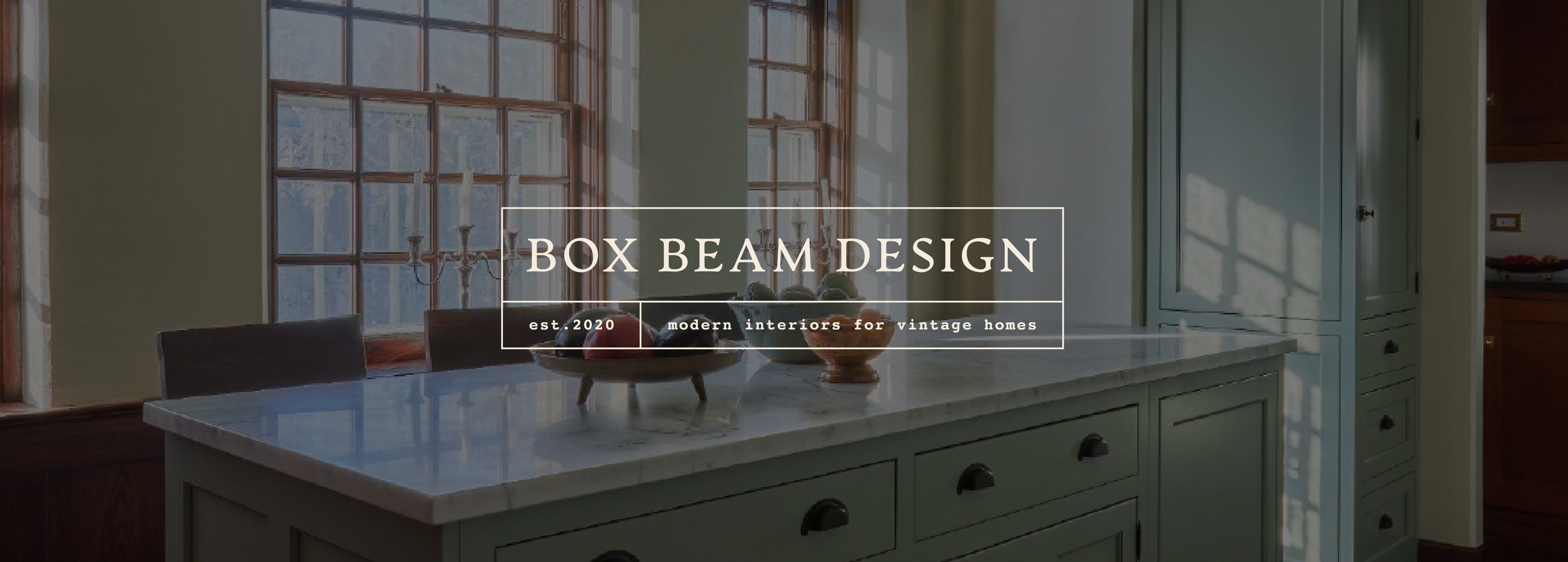
The main brand asset for this project was a website designed and built in Squarespace.

Interior view of a vintage kitchen with green cabinetry, wooden floors, a window, and a white marble island. A promotional flyer for Box Beam Design overlaying the image, featuring contact information and a small photo of a similar kitchen.
Two vertically oriented business cards on a greenish surface; the left card displays contact information for Emily Burns, an owner and designer, with email and web details. The right card features an illustration of a vintage-style bathroom with a sink, mirror, and window, with text indicating establishment year 2020 and the company name Box Beam Design, specializing in modern interiors for vintage homes.
Instagram profile page of boxbeamdesign showing interior design photos and trending topics.